- tidyverse
G. Moroz
1. Introduction
The tidyverse is a set of packages:
- dplyr, for data manipulation
- ggplot2, for data visualisation
- tidyr, for data tidying
- readr, for data import
- purrr, for functional programming
- tibble, for tibbles, a modern re-imagining of data frames
Install tidyverse package using install.packages(“tidyverse”).
library(tidyverse)## ── Attaching packages ──────────────────────────────── tidyverse 1.2.1 ──## ✔ ggplot2 2.2.1 ✔ purrr 0.2.4
## ✔ tibble 1.4.2 ✔ dplyr 0.7.4
## ✔ tidyr 0.8.0 ✔ stringr 1.3.0
## ✔ readr 1.1.1 ✔ forcats 0.3.0## ── Conflicts ─────────────────────────────────── tidyverse_conflicts() ──
## ✖ dplyr::filter() masks stats::filter()
## ✖ dplyr::lag() masks stats::lag()2. tible
head(iris)
as_tibble(iris)
data_frame(id = 1:12,
           letters = month.name)
3. Reading files: readr
library(readr) # included in tidyverse
df <- read_csv("https://goo.gl/v7nvho")
head(df)
df <- read_tsv("https://goo.gl/33r2Ut")
head(df)df <- read_delim("https://goo.gl/33r2Ut", delim = "\t")
head(df)4. dplyr
homo <- read_csv("http://goo.gl/Zjr9aF")
homo
The majority of examples in that presentation are based on Hau 2007. Experiment consisted of a perception and judgment test aimed at measuring the correlation between acoustic cues and perceived sexual orientation. Naïve Cantonese speakers were asked to listen to the Cantonese speech samples collected in Experiment and judge whether the speakers were gay or heterosexual. There are 14 speakers and following parameters:
- [s] duration (s.duration.ms)
- vowel duration (vowel.duration.ms)
- fundamental frequencies mean (F0) (average.f0.Hz)
- fundamental frequencies range (f0.range.Hz)
- percentage of homosexual impression (perceived.as.homo)
- percentage of heterosexal impression (perceived.as.hetero)
- speakers orientation (orientation)
- speakers age (age)
4.1 dplyr::filter()
How many speakers are older than 28?
homo %>%
  filter(age > 28, s.duration.ms < 60)
The %>% operators pipe their left-hand side values forward into expressions that appear on the right-hand side, i.e. one can replace f(x) with x %>% f().
sort(sqrt(abs(sin(1:22))), decreasing = TRUE)## [1] 0.9999951 0.9952926 0.9946649 0.9805088 0.9792468 0.9554817 0.9535709
## [8] 0.9173173 0.9146888 0.8699440 0.8665952 0.8105471 0.8064043 0.7375779
## [15] 0.7325114 0.6482029 0.6419646 0.5365662 0.5285977 0.3871398 0.3756594
## [22] 0.09408141:22 %>%
sin() %>%
abs() %>%
sqrt() %>%
sort(., decreasing = TRUE) # зачем здесь точка?## [1] 0.9999951 0.9952926 0.9946649 0.9805088 0.9792468 0.9554817 0.9535709
## [8] 0.9173173 0.9146888 0.8699440 0.8665952 0.8105471 0.8064043 0.7375779
## [15] 0.7325114 0.6482029 0.6419646 0.5365662 0.5285977 0.3871398 0.3756594
## [22] 0.09408144.2 dplyr::slice()
homo %>%
  slice(3:7)
4.3 dplyr::select()
homo %>%
  select(8:10)
homo %>%
select(speaker:average.f0.Hz)homo %>%
select(-speaker)homo %>%
select(-c(speaker, perceived.as.hetero, perceived.as.homo, perceived.as.homo.percent))homo %>%
select(speaker, age, s.duration.ms)4.4 dplyr::arrange()
homo %>%
  arrange(orientation, desc(age))
4.5 dplyr::distinct()
homo %>%
  distinct(orientation)
homo %>%
distinct(orientation, age > 20)4.6 dplyr::mutate()
homo %>%
  mutate(f0.mn = average.f0.Hz - f0.range.Hz/2,
         f0.mx = (average.f0.Hz + f0.range.Hz/2))
4.7 dplyr::group_by(...) %>% summarise(...)
homo %>%
  summarise(min(age), mean(s.duration.ms))
homo %>%
group_by(orientation) %>%
summarise(my_mean = mean(s.duration.ms))homo %>%
group_by(orientation) %>%
summarise(mean(s.duration.ms))homo %>%
group_by(orientation) %>%
summarise(mean_by_orientation = mean(s.duration.ms))If you need to count number of group members, it is posible to use function n() in summarise() or count() function if you don’t need any other statistics.
homo %>%
  group_by(orientation, age > 20) %>%
  summarise(my_mean = mean(s.duration.ms), n_observations = n())
homo %>%
count(orientation, age > 20)4.8 dplyr::.._join()
languages <- data_frame(
  languages = c("Selkup", "French", "Chukchi", "Kashubian"),
  countries = c("Russia", "France", "Russia", "Poland"),
  iso = c("sel", "fra", "ckt", "pol")
  )
languages
country_population <- data_frame(
countries = c("Russia", "Poland", "Finland"),
population_mln = c(143, 38, 5))
country_populationinner_join(languages, country_population)left_join(languages, country_population)right_join(languages, country_population)anti_join(languages, country_population)anti_join(country_population, languages)full_join(country_population, languages)There is a nice trick that groups together calculated statistics with source data.frame. Just use .._join():
homo %>%
  group_by(orientation, age > 20) %>%
  summarise(my_mean = mean(s.duration.ms), n_observations = n())
homo %>%
group_by(orientation, age > 20) %>%
summarise(my_mean = mean(s.duration.ms), n_observations = n()) %>%
left_join(homo)5. tidyr package
- Short format
df.short <- data.frame(
                   consonant = c("stops", "fricatives", "affricates", "nasals"),
                   initial = c(123, 87, 73, 7),
                   intervocal = c(57, 77, 82, 78),
                   final = c(30, 69, 12, 104))
df.short- Long format
- Short format → Long format:
tidyr::gather()
df.short <- data.frame(
                   consonant = c("stops", "fricatives", "affricates", "nasals"),
                   initial = c(123, 87, 73, 7),
                   intervocal = c(57, 77, 82, 78),
                   final = c(30, 69, 12, 104))
df.short
df.short %>%
gather(position, number, initial:final) ->
df.long
df.long- Long format → Short format:
tidyr::spread()
df.long %>%
  spread(position, number) ->
  df.short
df.short
6. Visualisation
6.0.1 Anscombe’s quartet
In Anscombe, F. J. (1973). “Graphs in Statistical Analysis” was presented the next sets of data:
quartet <- read.csv("https://goo.gl/KuuzYy")
quartet
quartet %>%
group_by(dataset) %>%
summarise(mean_X = mean(x),
mean_Y = mean(y),
sd_X = sd(x),
sd_Y = sd(y),
cor = cor(x, y),
n_obs = n()) %>%
select(-dataset) %>%
round(., 2)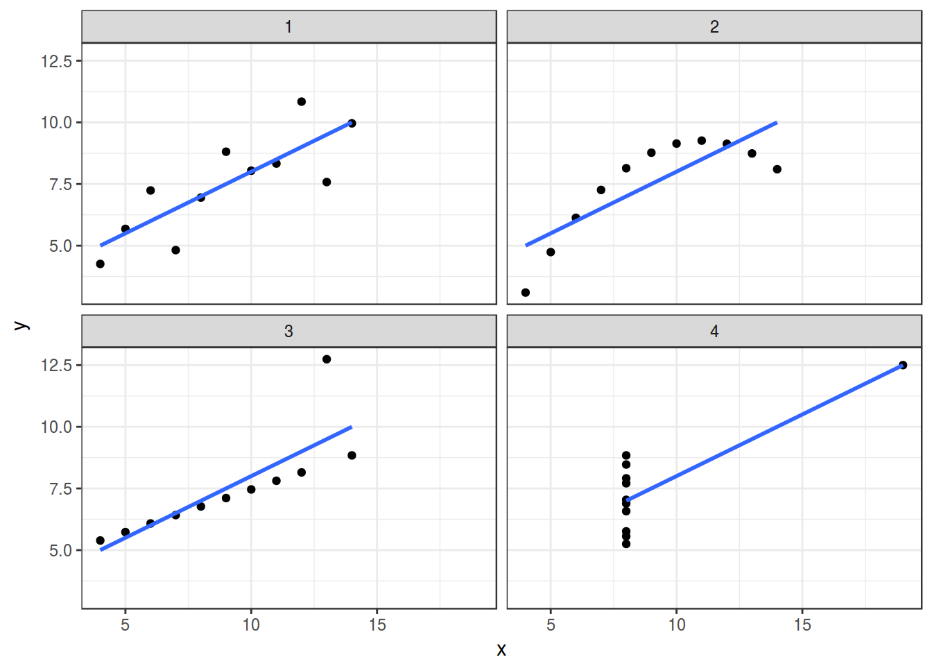
6.0.2 Datasaurus
In Matejka and Fitzmaurice (2017) “Same Stats, Different Graphs” was presented the next sets of data:
datasaurus <- read_tsv("https://goo.gl/gtaunr")
head(datasaurus)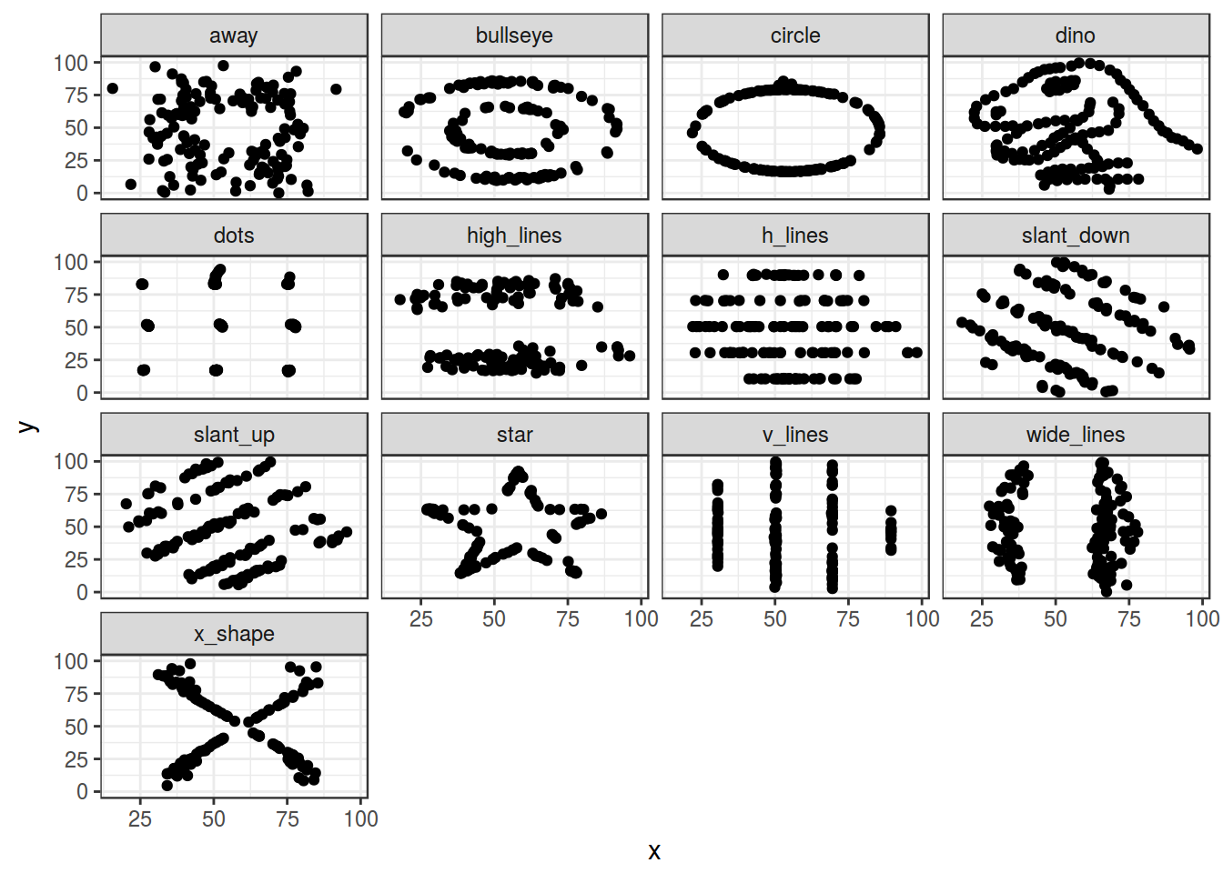
datasaurus %>%
  group_by(dataset) %>%
  summarise(mean_X = mean(x),
            mean_Y = mean(y),
            sd_X = sd(x),
            sd_Y = sd(y),
            cor = cor(x, y),
            n_obs = n()) %>%
  select(-dataset) %>%
  round(., 1)
6.1 Scaterplot
- ggplot2
ggplot(data = homo, aes(s.duration.ms, vowel.duration.ms)) +
  geom_point()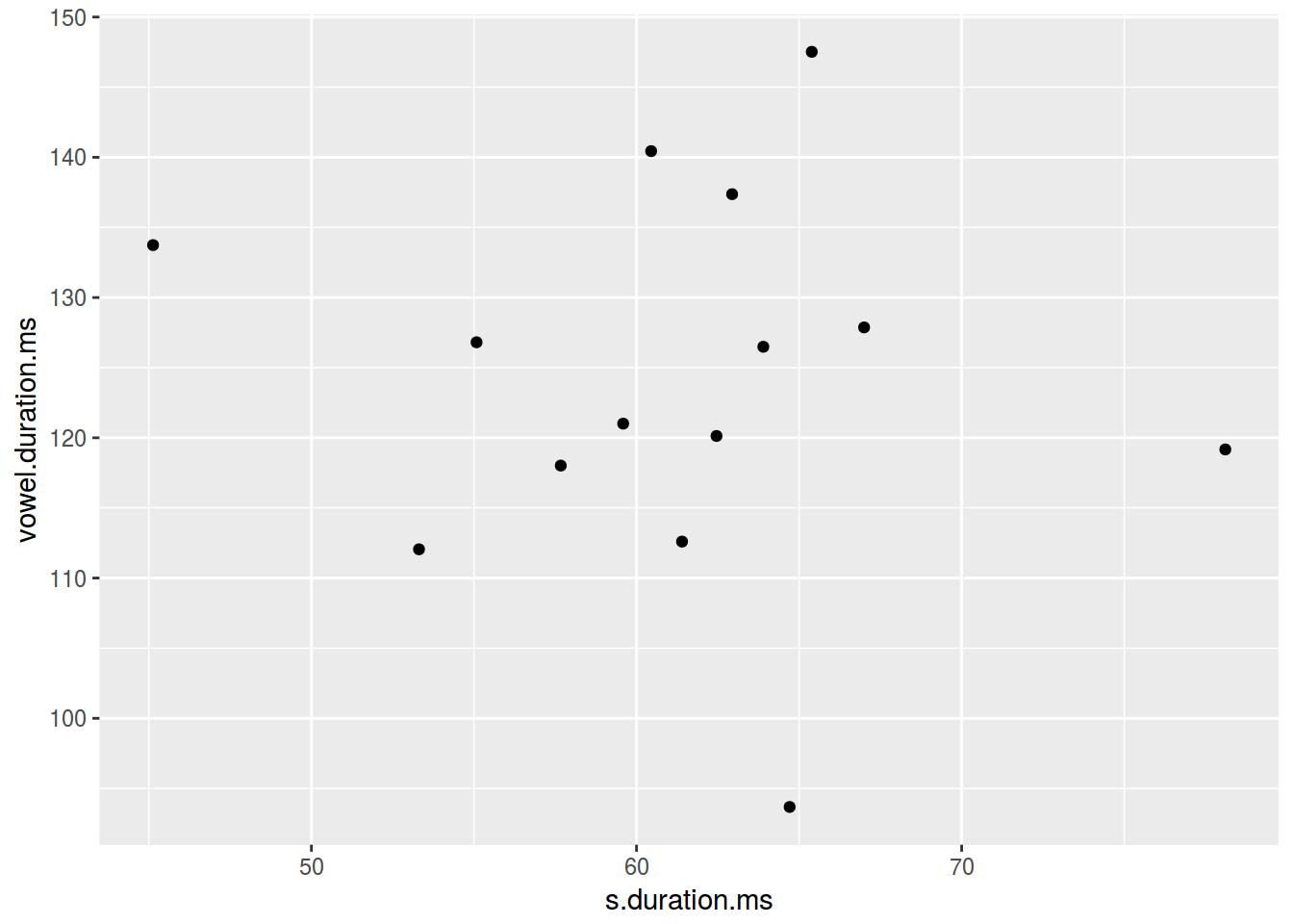
- dplyr, ggplot2
homo %>%
  ggplot(aes(average.f0.Hz, age))+
  geom_smooth(method = "lm")+
  geom_point(aes(color = orientation))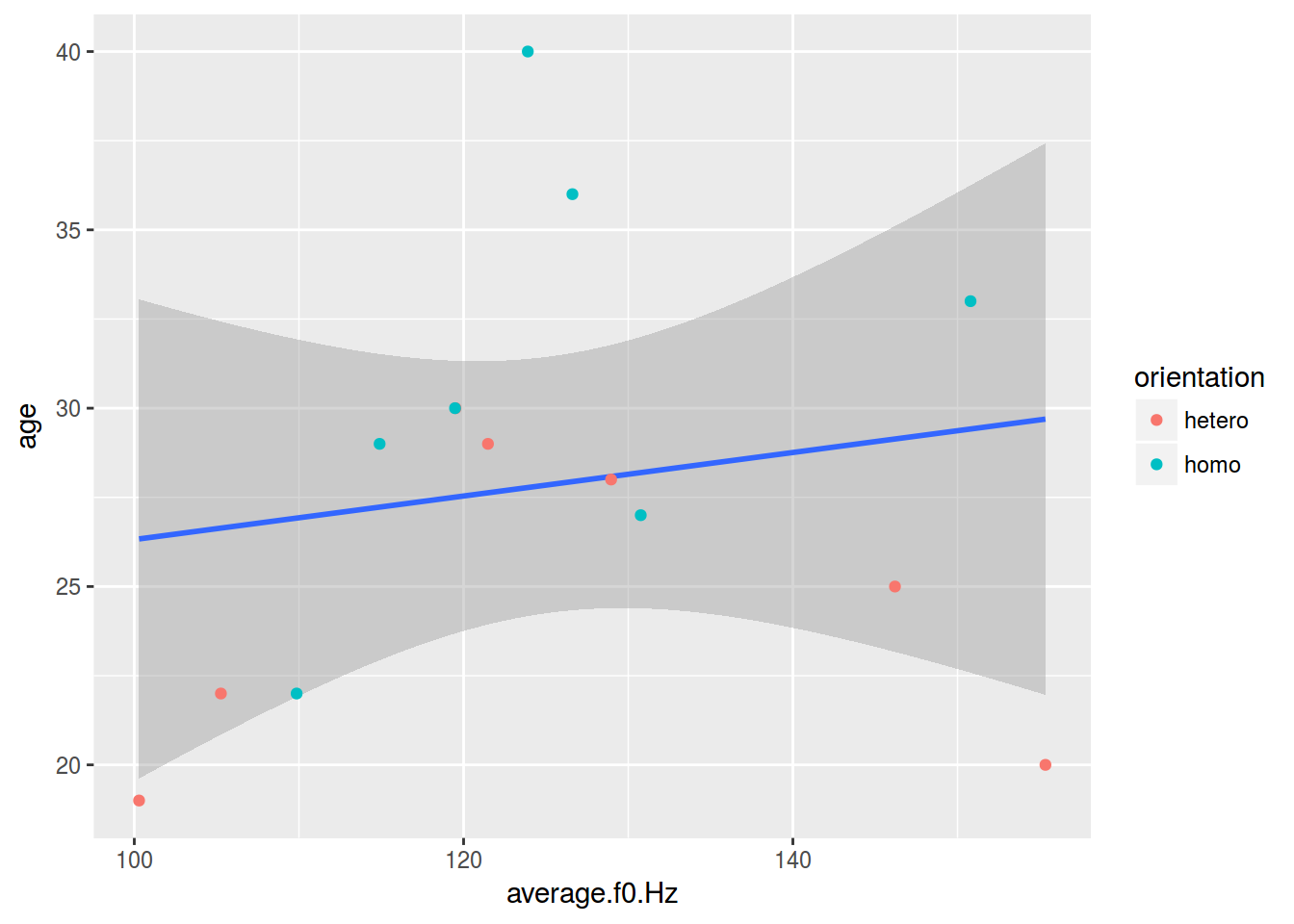
6.1.1 Scaterplot: color
homo %>%
  ggplot(aes(s.duration.ms, vowel.duration.ms,
             color = orientation)) +
  geom_point()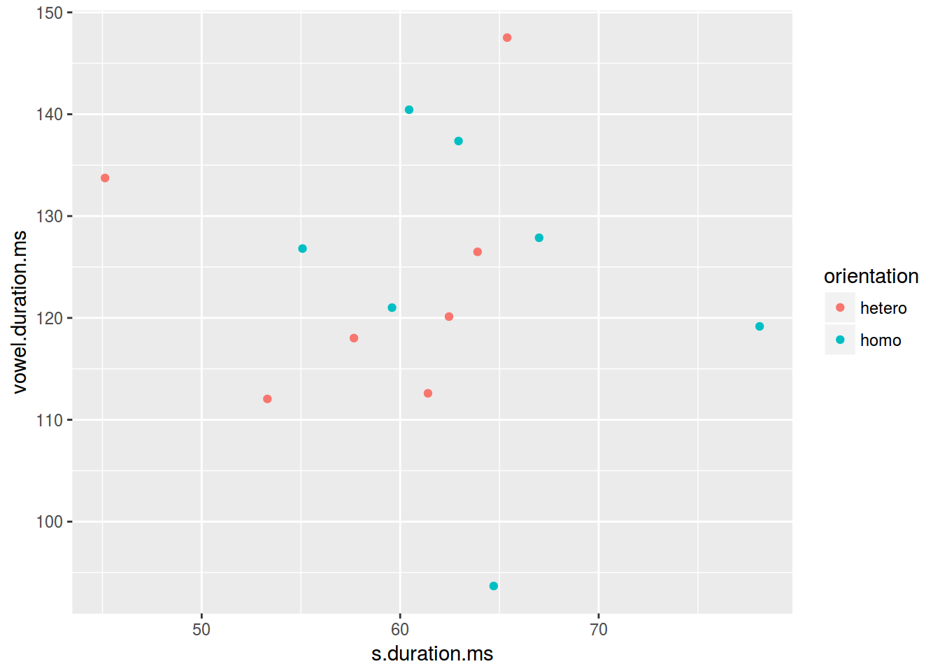
6.1.2 Scaterplot: shape
homo %>%
  ggplot(aes(s.duration.ms, vowel.duration.ms,
             shape = orientation)) +
  geom_point(color = "green")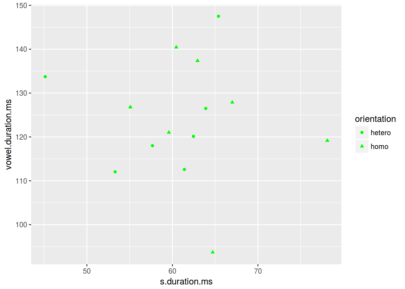
6.1.3 Scaterplot: size
homo %>%
  ggplot(aes(s.duration.ms, vowel.duration.ms,
             size = age)) +
  geom_point()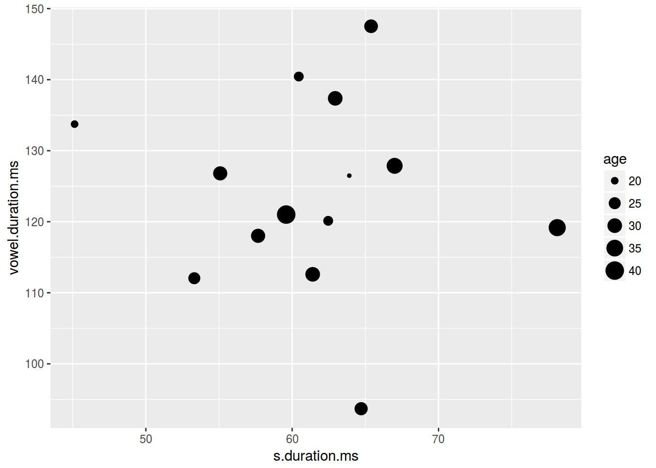
6.1.4 Scaterplot: text
homo %>%
  mutate(label = ifelse(orientation == "homo","⚣", "⚤")) %>%
  ggplot(aes(s.duration.ms, vowel.duration.ms, label = label, fill = orientation)) +
  geom_label()
homo %>%
  mutate(label = ifelse(orientation == "homo","⚣", "⚤")) %>%
  ggplot(aes(s.duration.ms, vowel.duration.ms, label = label, color = orientation)) +
  geom_text()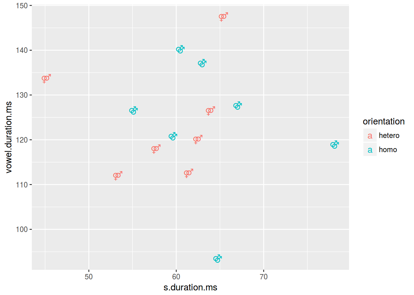
6.1.5 Scaterplot: title
homo %>%
  ggplot(aes(s.duration.ms, vowel.duration.ms)) +
  geom_point()+
  labs(title = "length of [s] vs. length of vowels",
       subtitle = "based on 14 speakers of Cantonese",
       caption = "data from [Hau 2007]")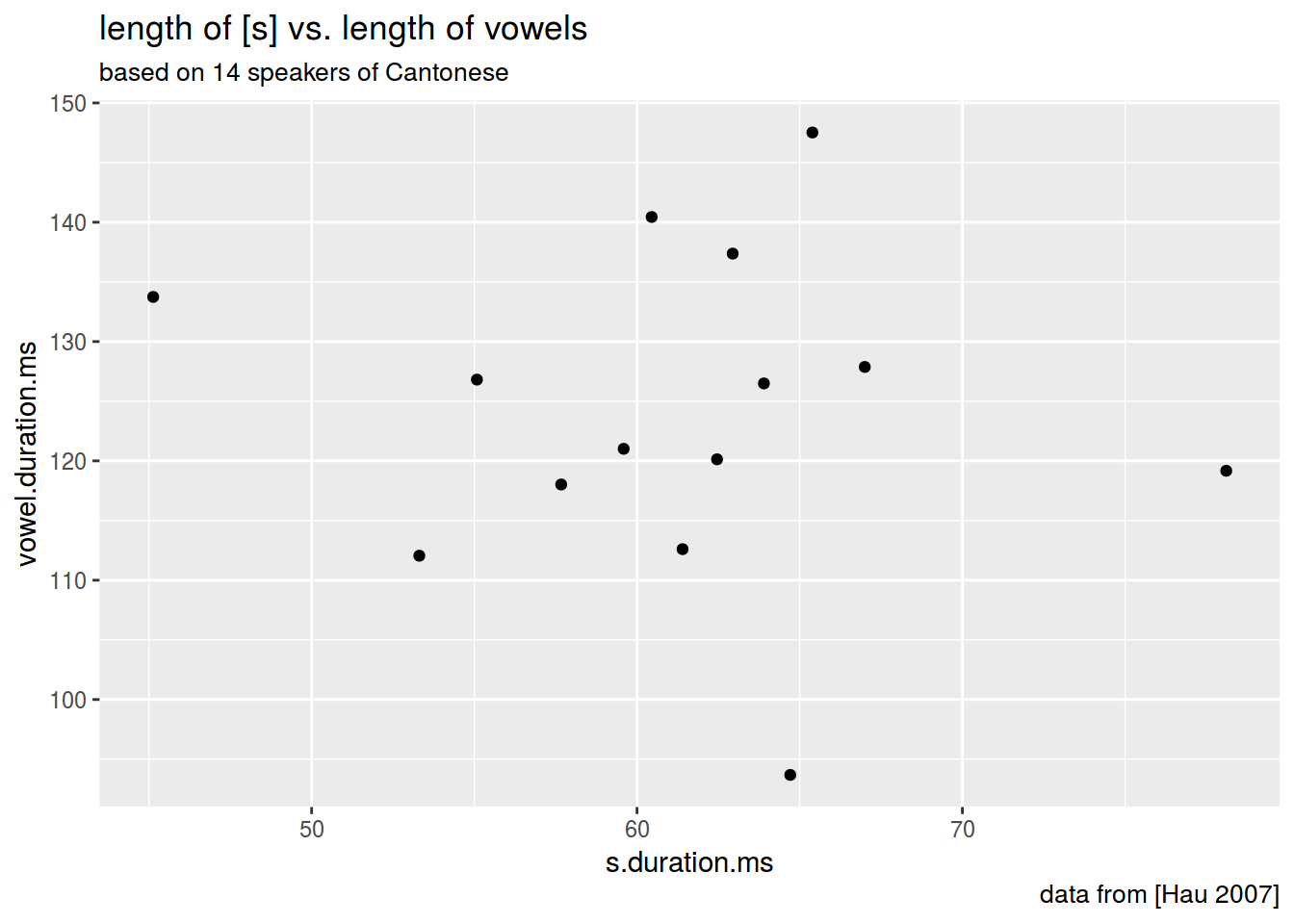
6.1.6 Scaterplot: axis
homo %>%
  ggplot(aes(s.duration.ms, vowel.duration.ms)) +
  geom_point()+
  xlab("duration of [s] in ms")+
  ylab("vowel duration in ms")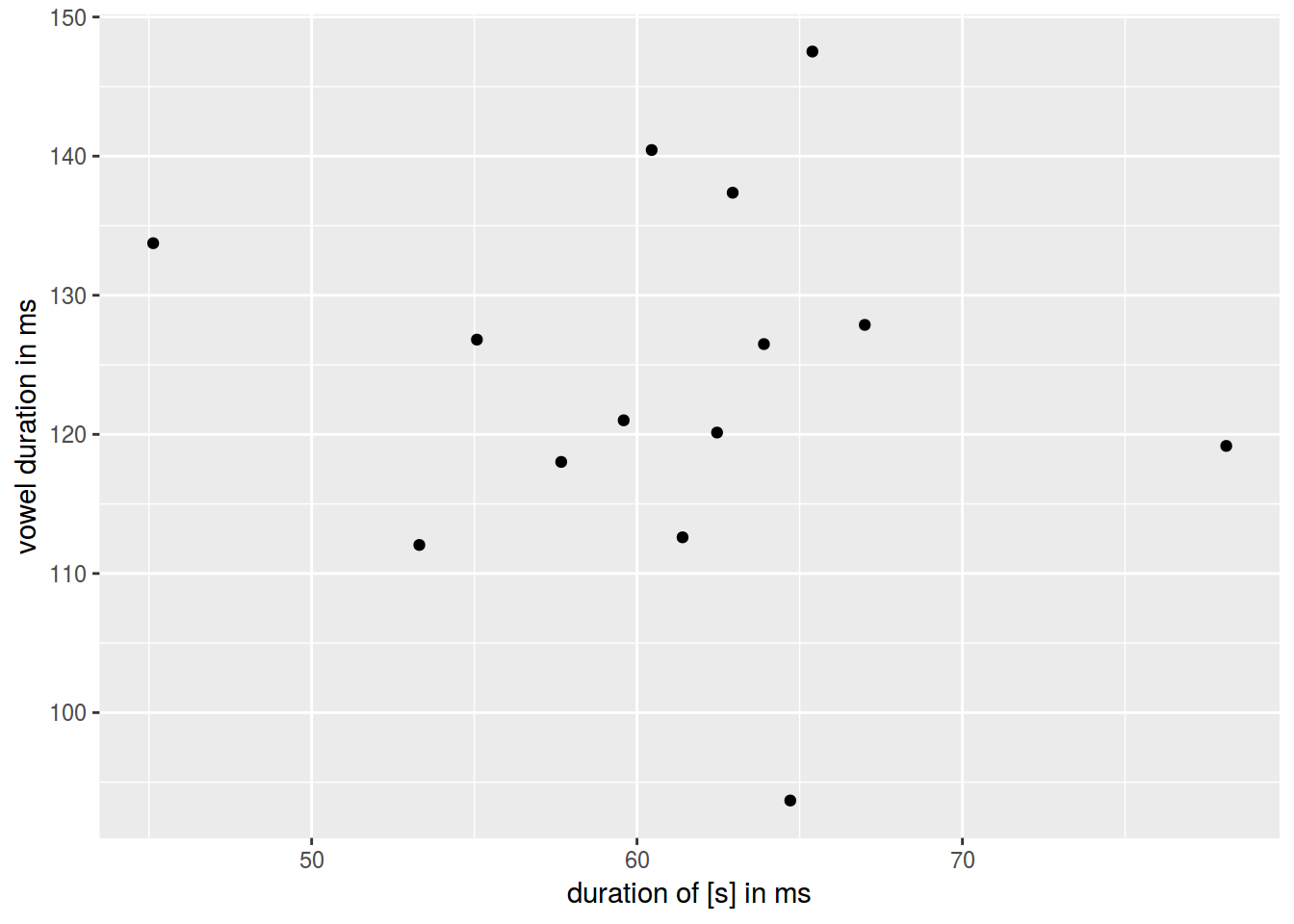
6.1.7 Log scales

Lets use the frequency dictionary for Russian
freq <- read.csv("https://goo.gl/TlX7xW", sep = "\t")
freq %>%
  arrange(desc(Freq.ipm.)) %>%
  slice(1:200) %>%
  ggplot(aes(Rank, Freq.ipm.)) +
  geom_point() +
  xlab("") +
  ylab("ipm")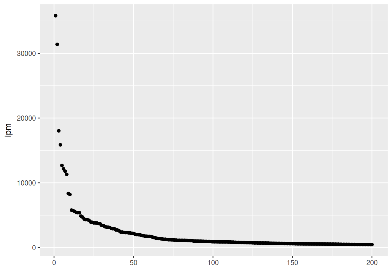
freq %>%
  ggplot(aes(1:52138, Freq.ipm.))+
  geom_point()+
  xlab("")+
  ylab("ipm")+
  scale_y_log10()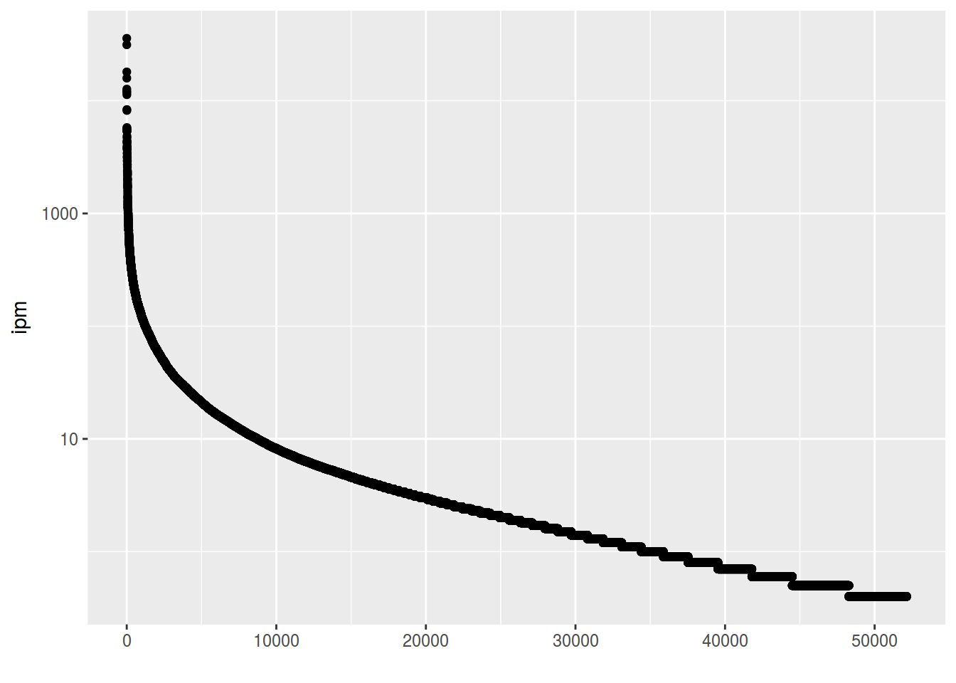
6.1.8 Scaterplot: rug
homo %>%
  ggplot(aes(s.duration.ms, vowel.duration.ms, color = orientation)) +
  geom_point() +
  geom_rug()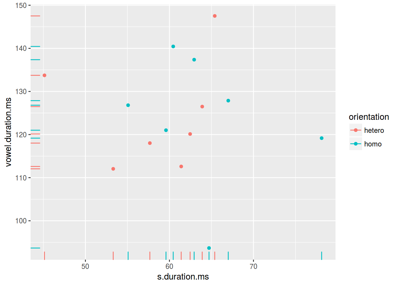
6.1.9 Scaterplot: lines
homo %>%
  ggplot(aes(s.duration.ms, vowel.duration.ms)) +
  geom_point() +
  geom_hline(yintercept = mean(homo$vowel.duration.ms))+
  geom_vline(xintercept = 60)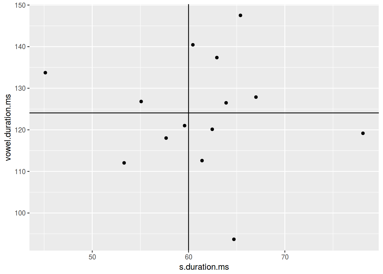
homo %>%
  ggplot(aes(s.duration.ms, vowel.duration.ms)) +
  geom_point() +
  geom_hline(yintercept = 120, linetype = 2)+
  geom_vline(xintercept = 60, size = 5)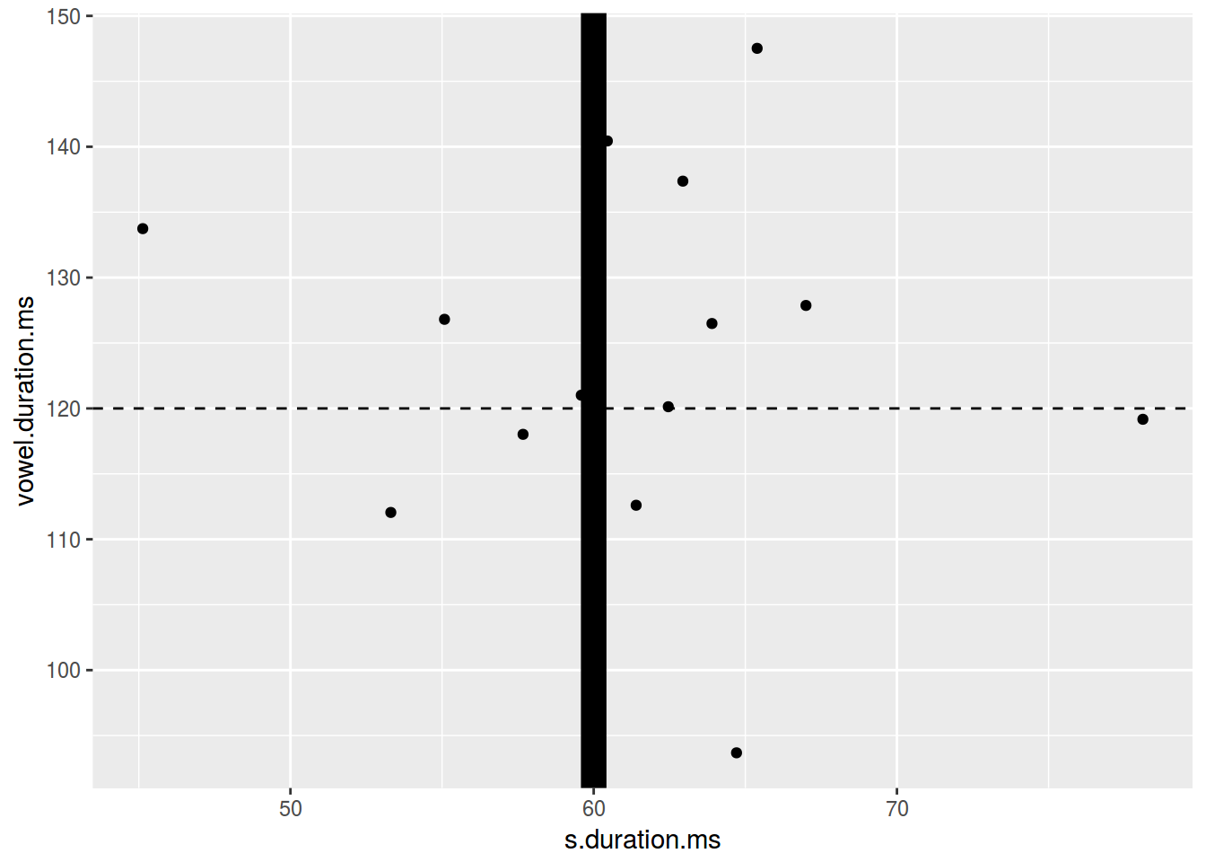
homo %>%
  ggplot(aes(s.duration.ms, vowel.duration.ms)) +
  geom_point() +
  geom_hline(yintercept = 120, linetype = 4)+
  geom_vline(xintercept = 60, color = "blue")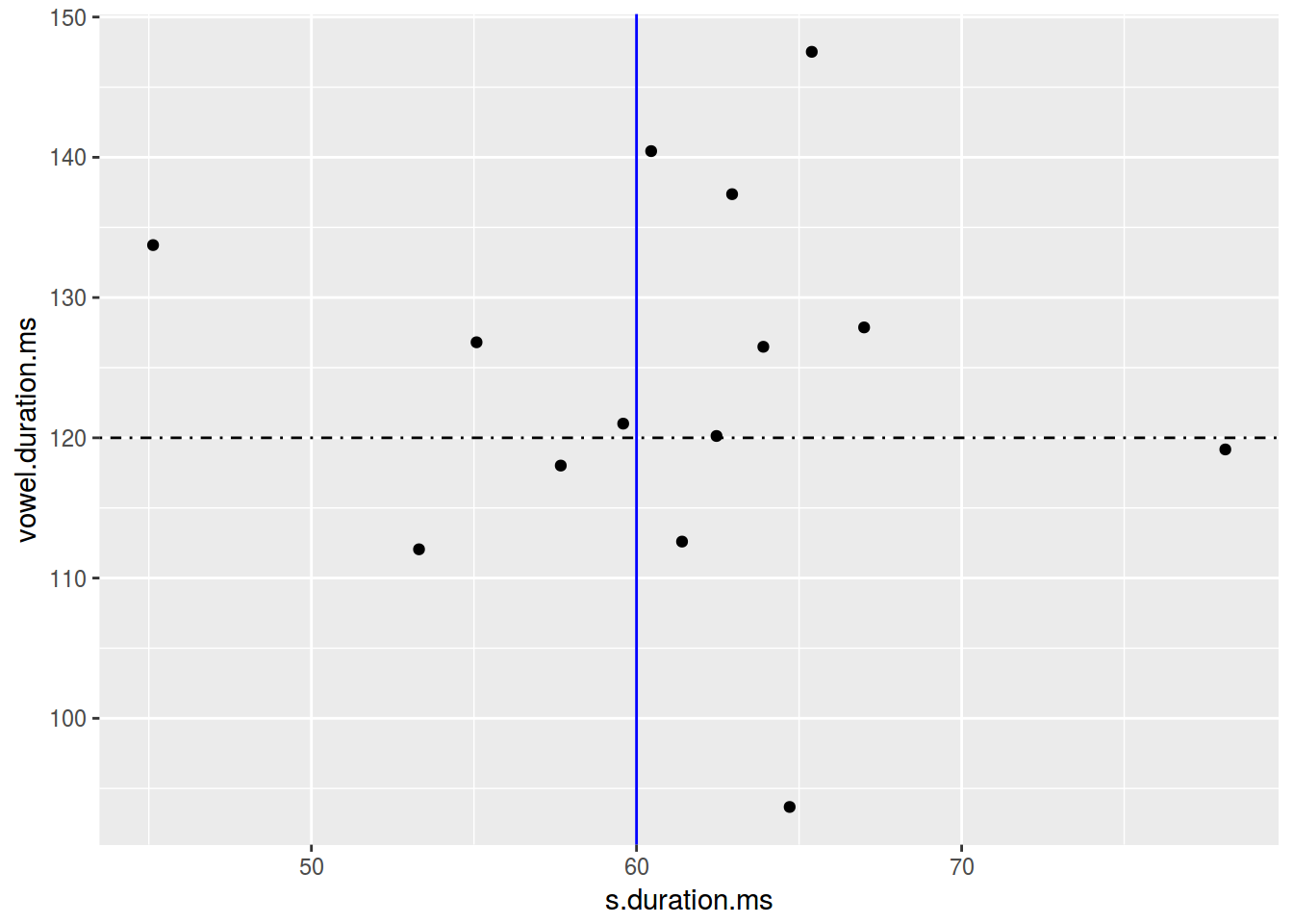
6.1.10 Scaterplot: annotate
Функция annotate добавляет geom к графику.
homo %>%
  ggplot(aes(s.duration.ms, vowel.duration.ms)) +
  geom_point()+
  annotate(geom = "rect", xmin = 77, xmax = 79,
           ymin = 117, ymax = 122, fill = "red", alpha = 0.2) +
  annotate(geom = "text", x = 78, y = 125,
           label = "Who is that?\n Outlier?")
6.2 Barplots
There are two possible situations:
- not aggregate data
head(homo[, c(1, 9)])- aggregate data
head(homo[, c(1, 10)])homo %>%
ggplot(aes(orientation)) +
geom_bar()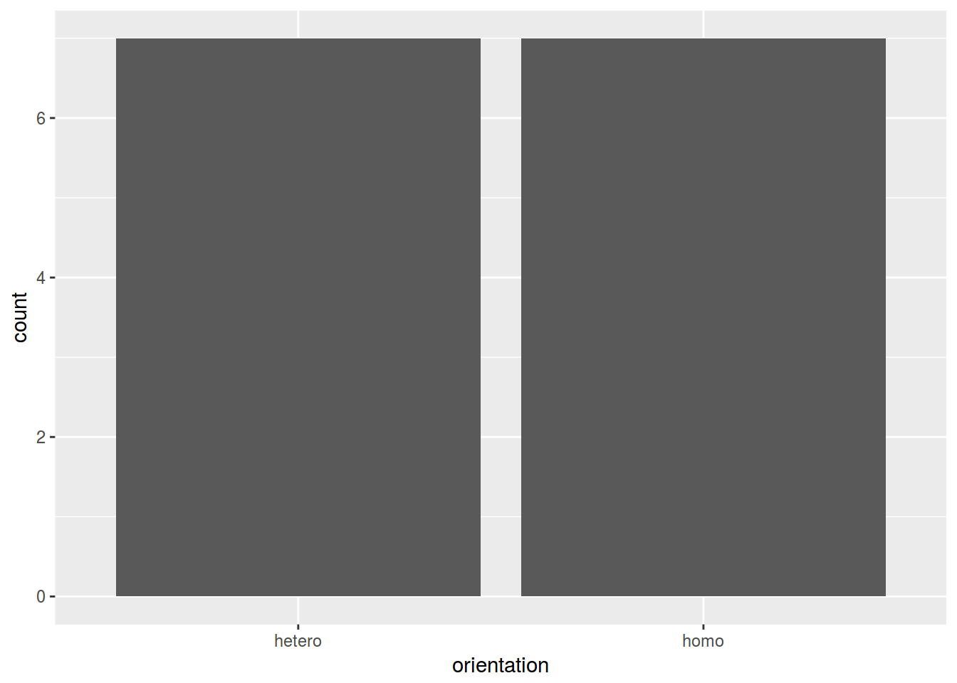
homo %>%
  ggplot(aes(speaker, age)) +
  geom_col()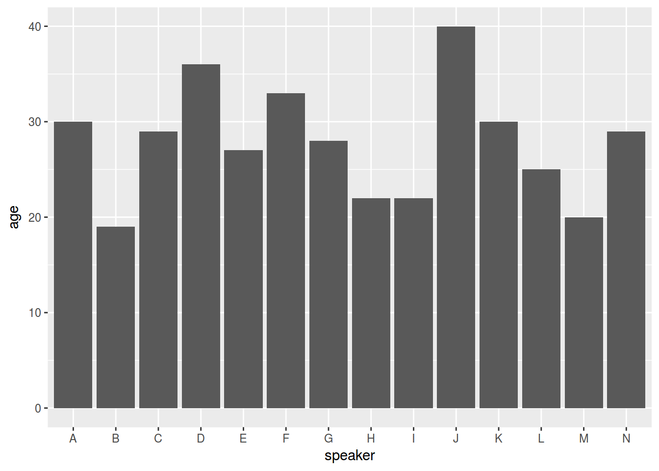
homo %>%
  ggplot(aes(speaker, age, fill = orientation)) +
  geom_col()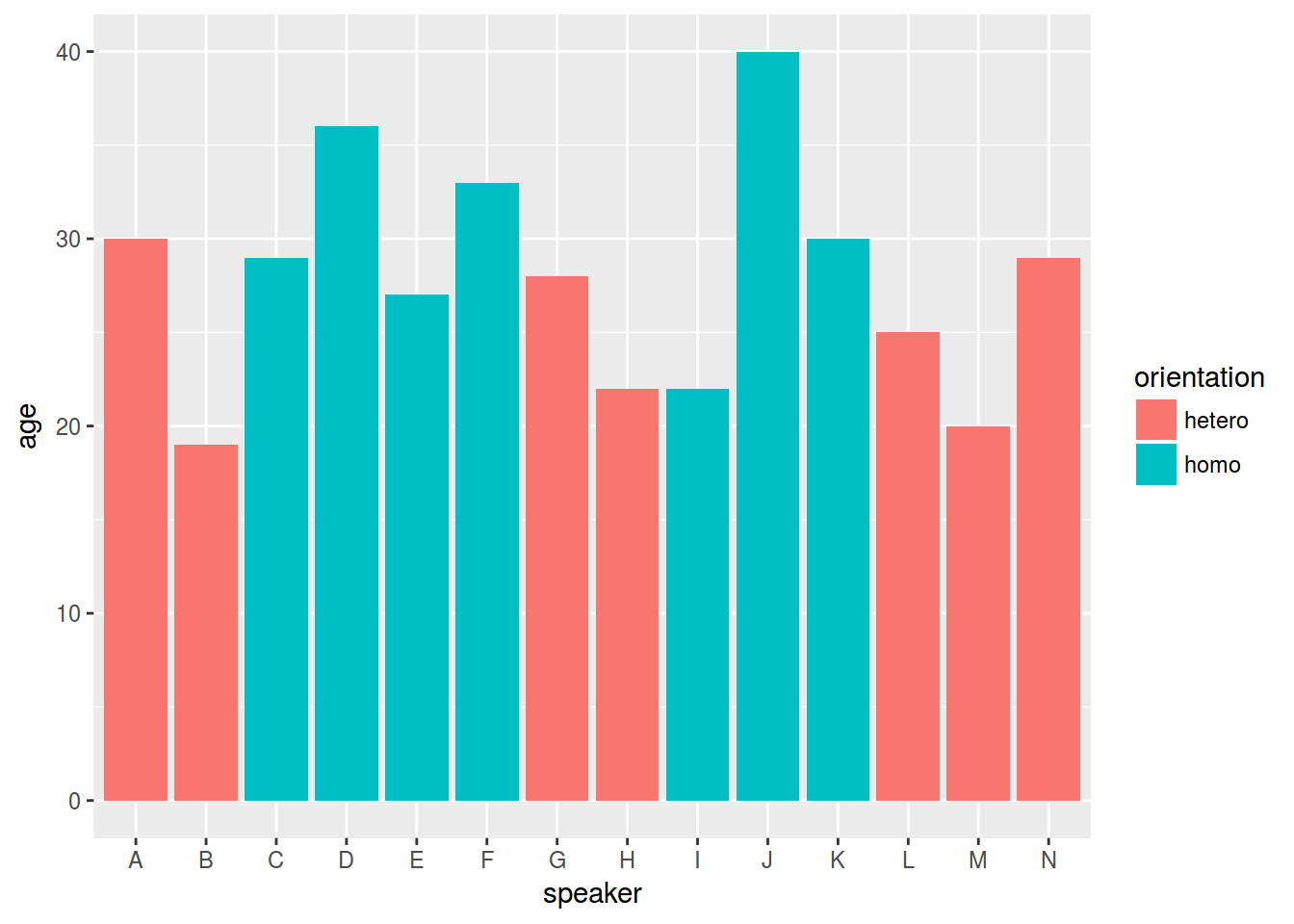
6.3 Boxplots: basics, points, jitter
homo %>%
  ggplot(aes(orientation, s.duration.ms)) +
  geom_boxplot()
homo %>%
  ggplot(aes(orientation, s.duration.ms)) +
  geom_boxplot()+
  geom_point()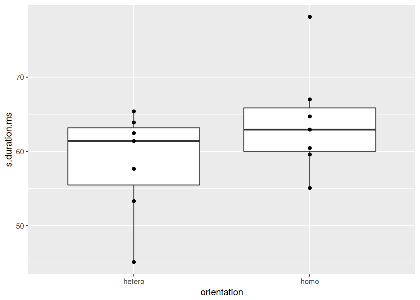
homo %>%
  ggplot(aes(orientation, s.duration.ms)) +
  geom_boxplot() +
  geom_jitter(width = 0.5)
homo %>%
  ggplot(aes(orientation, s.duration.ms)) +
  geom_violin() +
  geom_jitter()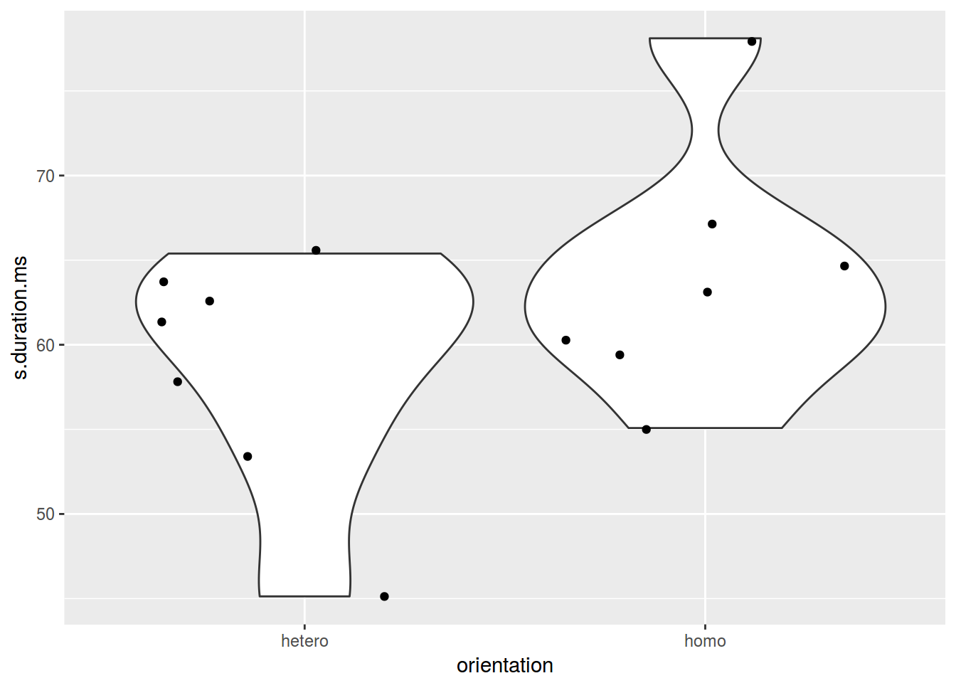
6.1-3 Preliminary summary: two variables
- scaterplot: two quantitative varibles
- barplot: nominal varible and one number
- boxplot: nominal varible and quantitative varibles
- jittered points or sized points: two nominal varibles
mtcars %>%
  mutate(newvar = mpg > 22,
         newvr = mpg < 17) %>%
  ggplot(aes(newvr, newvar, color = newvar))+
  geom_jitter(width = 0.2)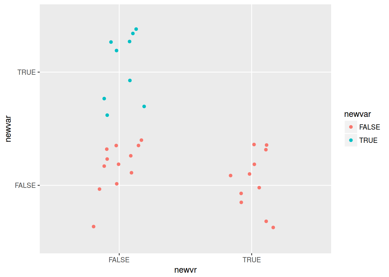
mtcars %>%
  mutate(newvar = mpg > 22,
         newvr = mpg < 17) %>%
  group_by(newvar, newvr) %>%
  summarise(number = n()) %>%
  ggplot(aes(newvr, newvar, label = number))+
  geom_point(aes(size = number, color = newvar))+
  geom_text()+
  scale_size(range = c(10, 30))+
  guides(size = F)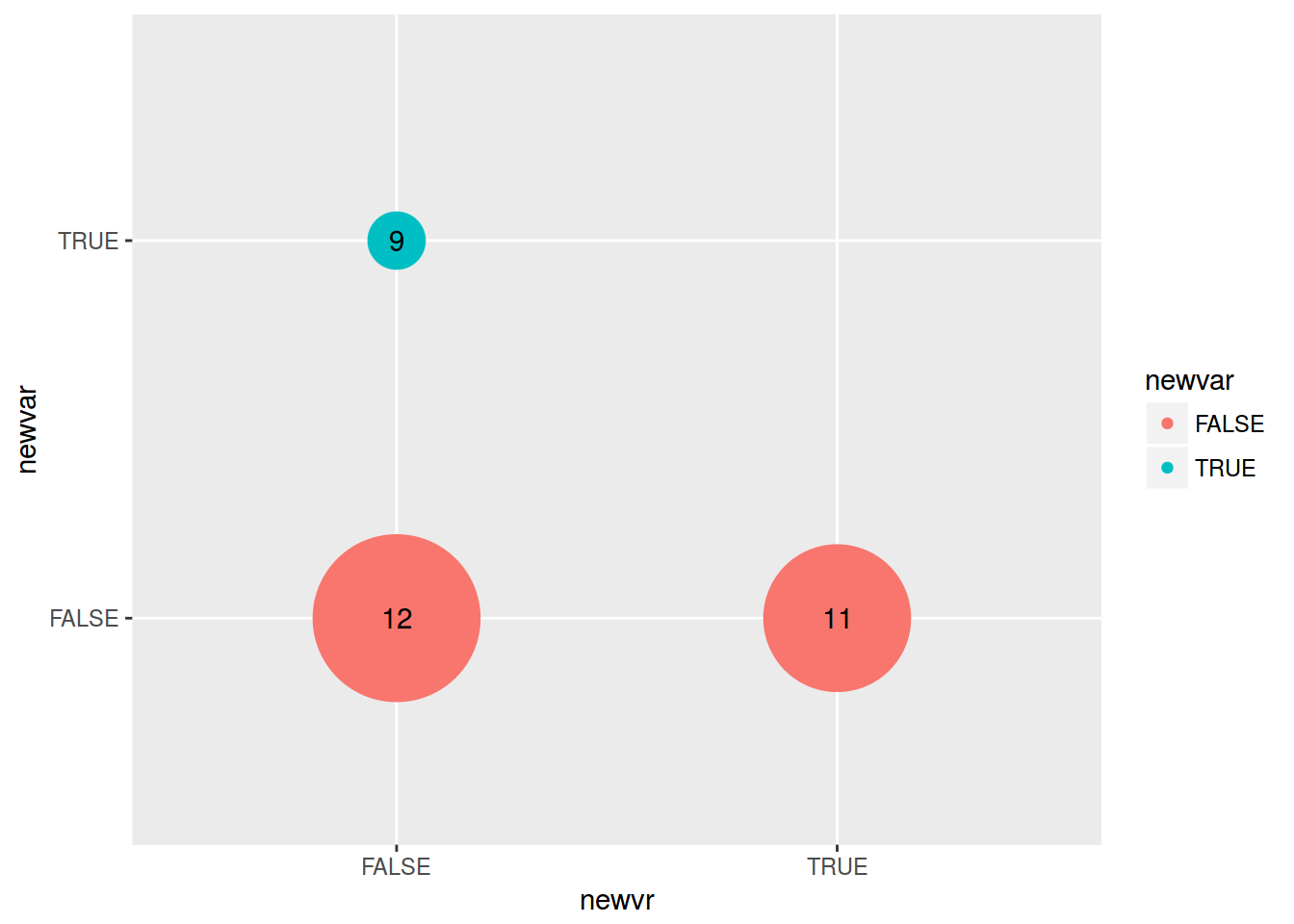
6.4 Histogram
homo %>%
  ggplot(aes(s.duration.ms)) +
  geom_histogram()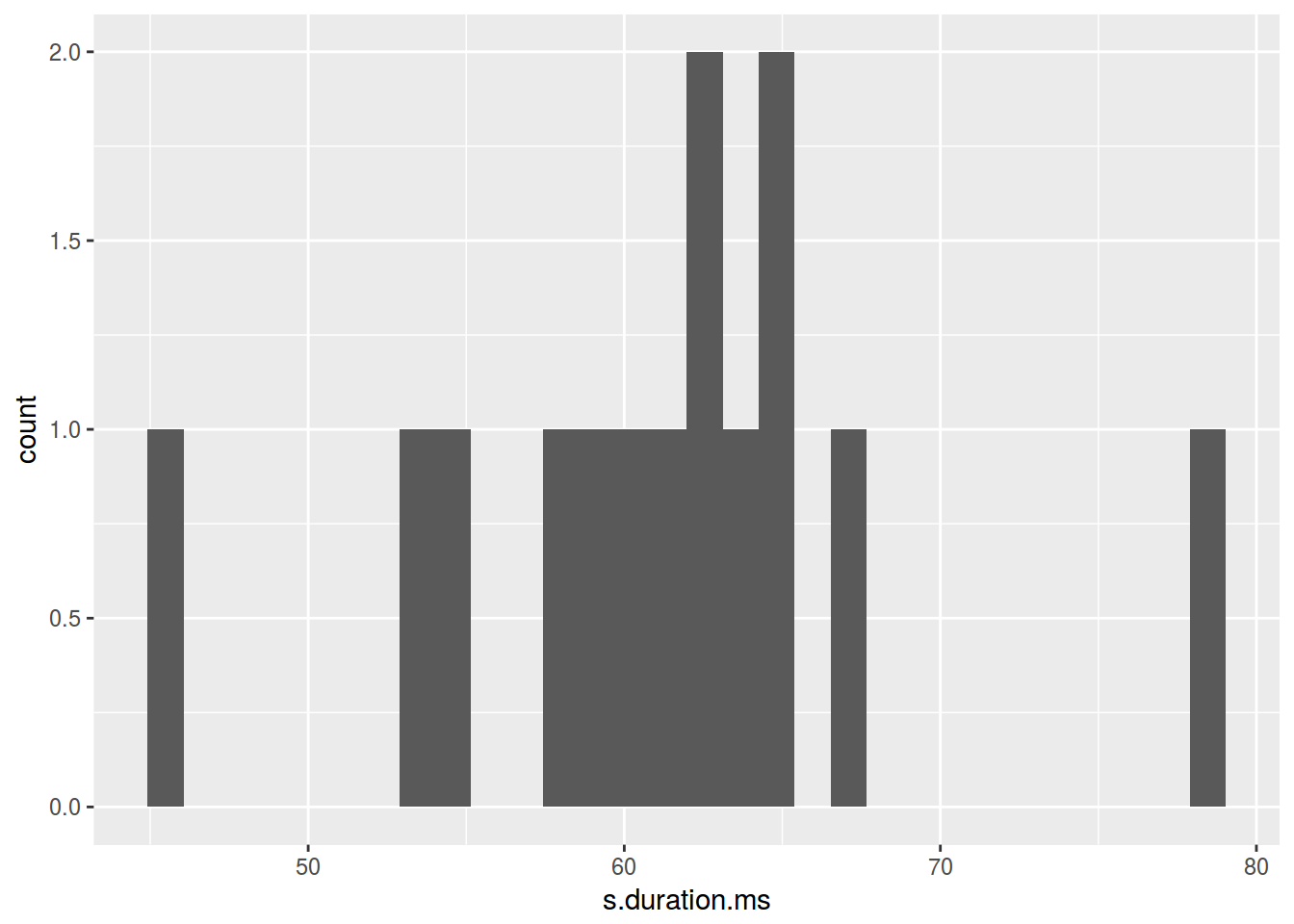
How many histogram bins do we need?
- [Sturgers 1926]
nclass.Sturges(homo$s.duration.ms) - [Scott 1979]
nclass.scott(homo$s.duration.ms) - [Freedman, Diaconis 1981]
nclass.FD(homo$s.duration.ms)
homo %>%
  ggplot(aes(s.duration.ms)) +
  geom_histogram(bins = nclass.FD(homo$s.duration.ms))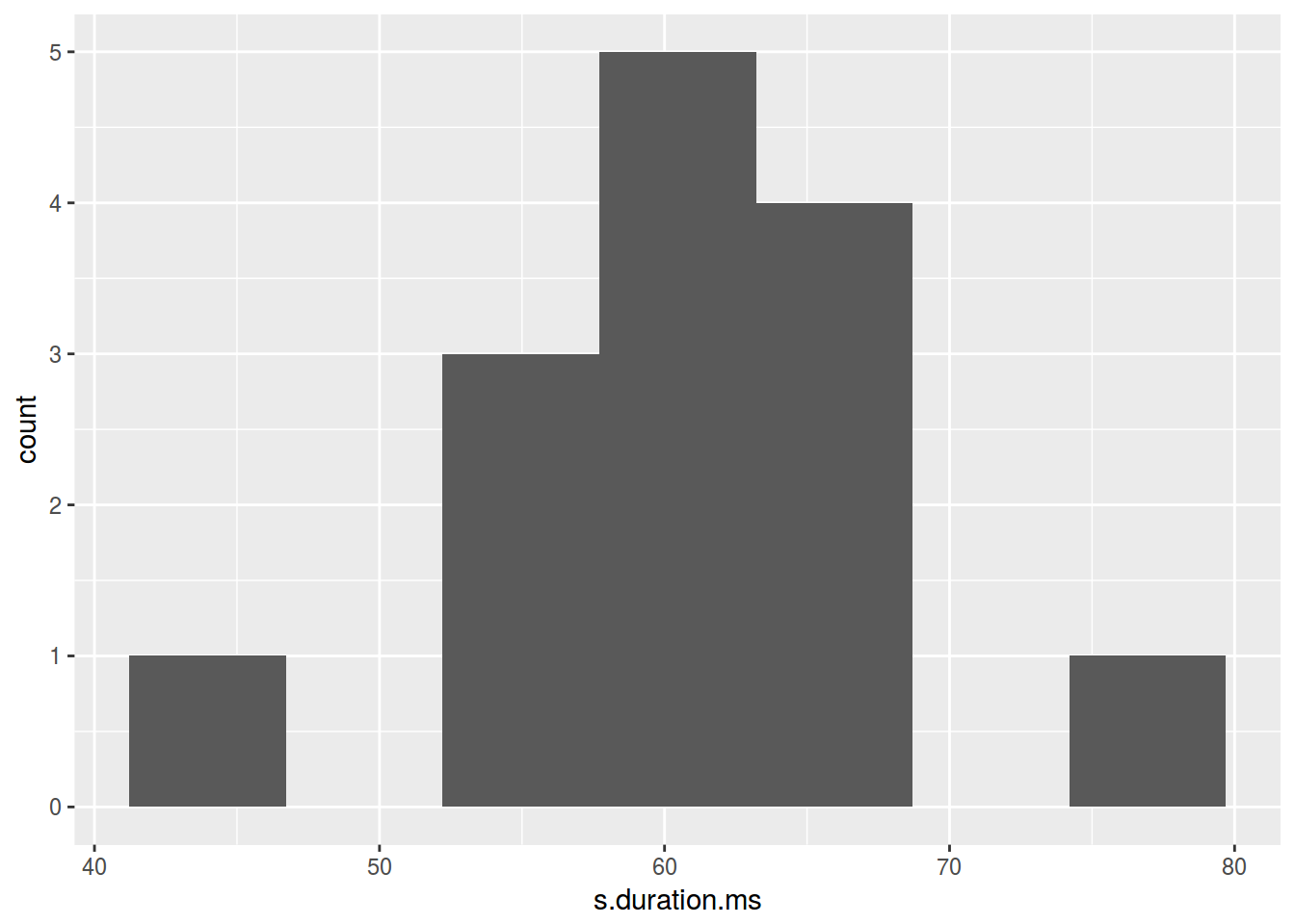
homo %>%
  ggplot(aes(s.duration.ms)) +
  geom_histogram(fill = "lightblue")
6.5 Density plot
homo %>%
  ggplot(aes(s.duration.ms)) +
  geom_density()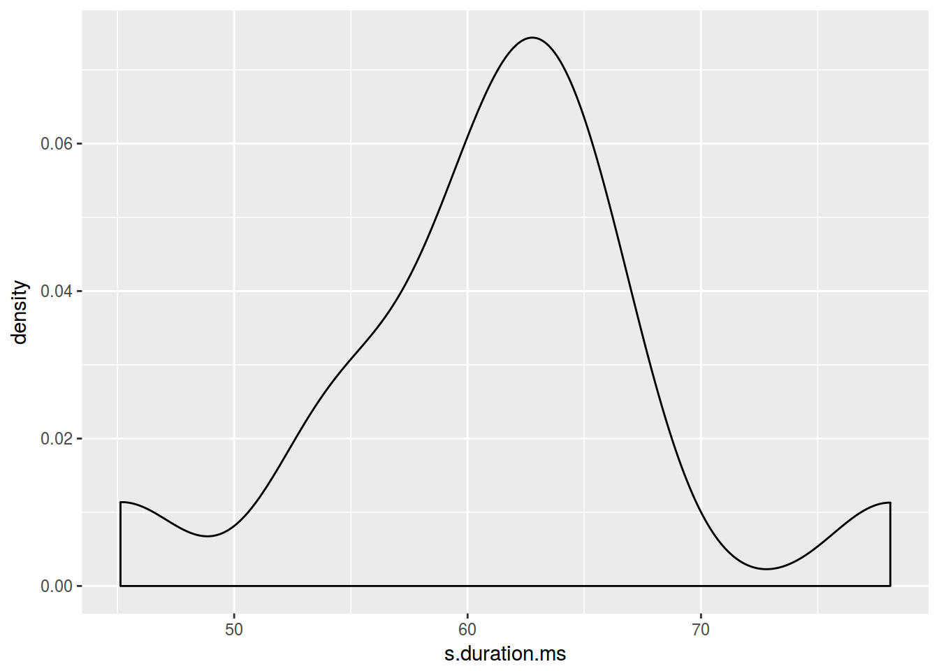
homo %>%
  ggplot(aes(s.duration.ms)) +
  geom_density(color = "blue")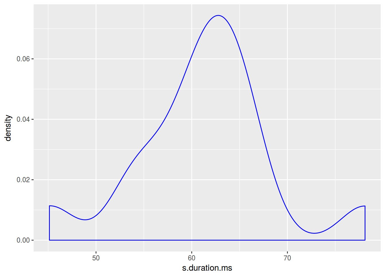
homo %>%
  ggplot(aes(s.duration.ms)) +
  geom_density(fill = "lightblue")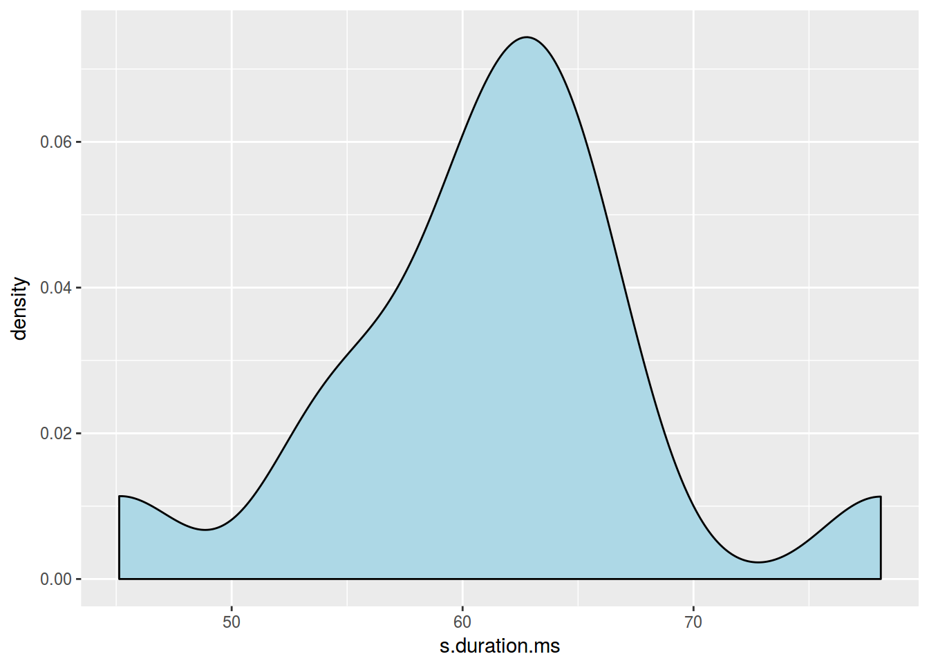
homo %>%
  ggplot(aes(s.duration.ms, fill = orientation)) +
  geom_density()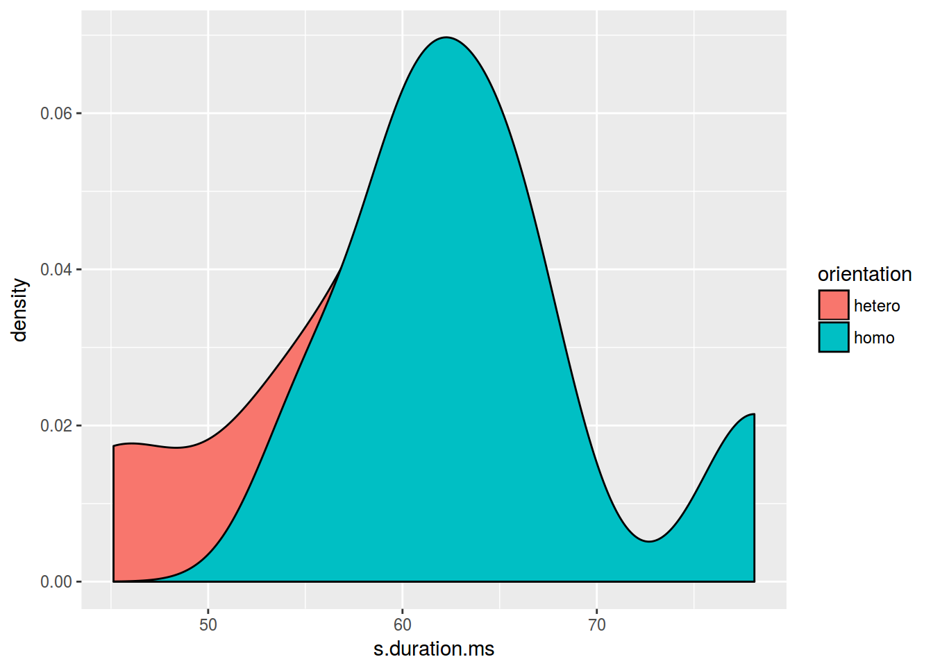
homo %>%
  ggplot(aes(s.duration.ms, fill = orientation)) +
  geom_density(alpha = 0.2)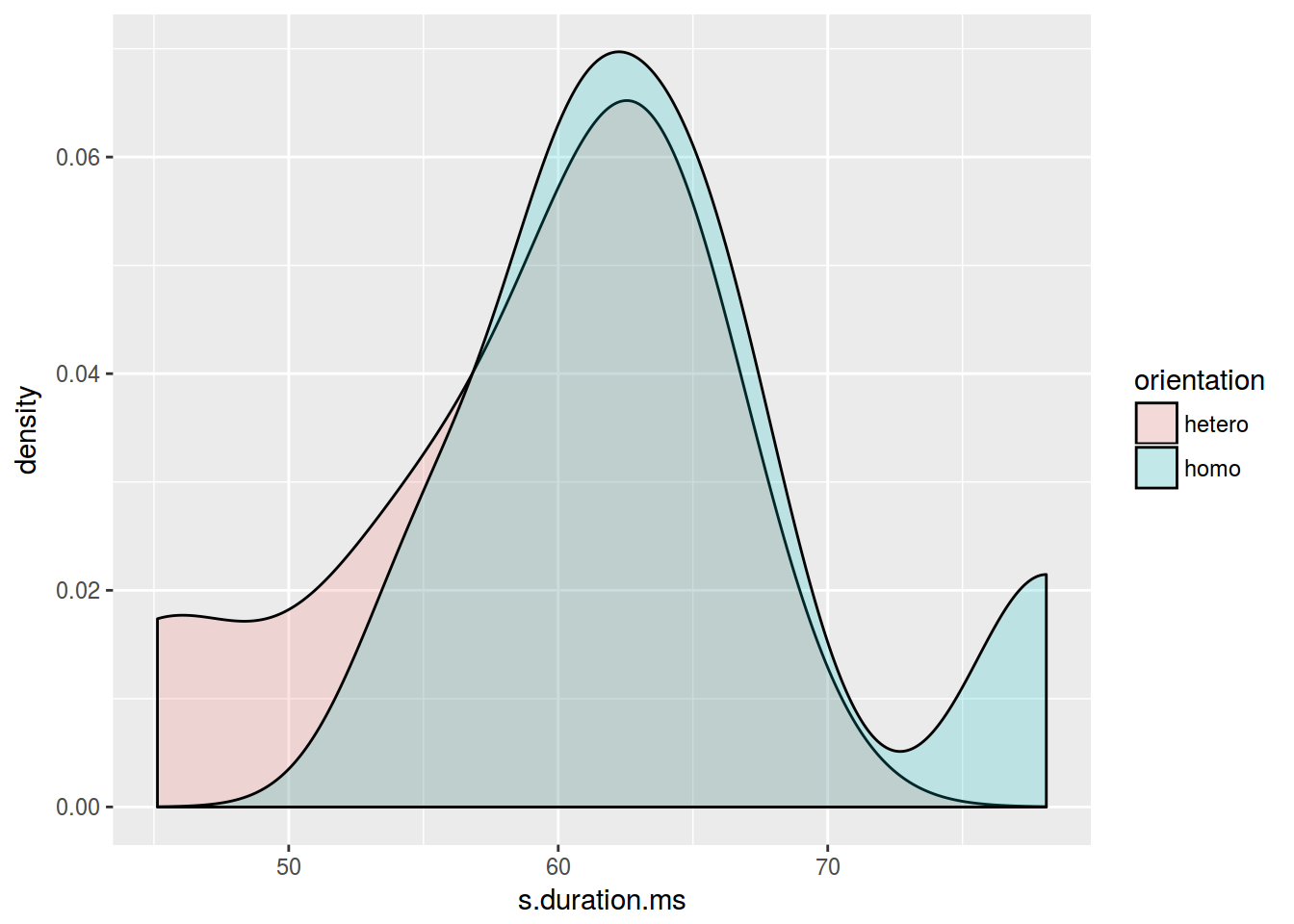
library(ggridges)
homo %>%
  ggplot(aes(s.duration.ms, orientation, fill = orientation)) +
  geom_density_ridges()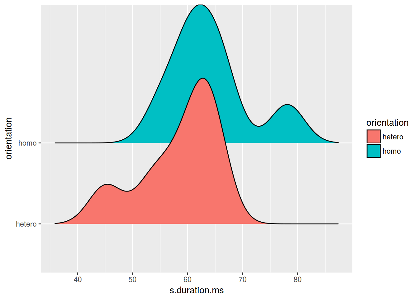
6.7 Facets
6.7.1 ggplot2::facet_wrap()
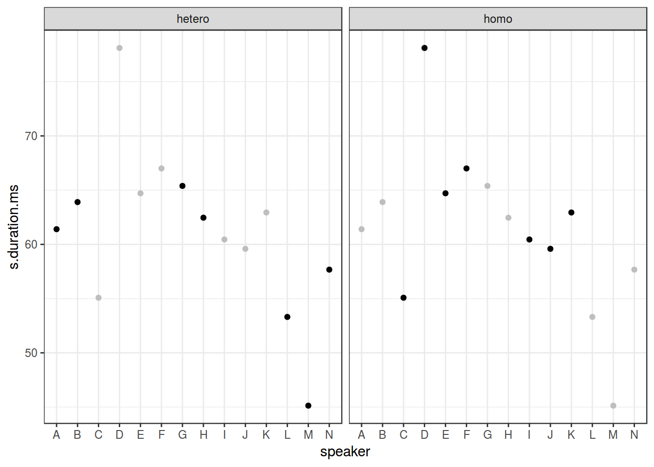
homo %>%
  ggplot(aes(speaker, s.duration.ms))+
  geom_point() +
  facet_wrap(~orientation)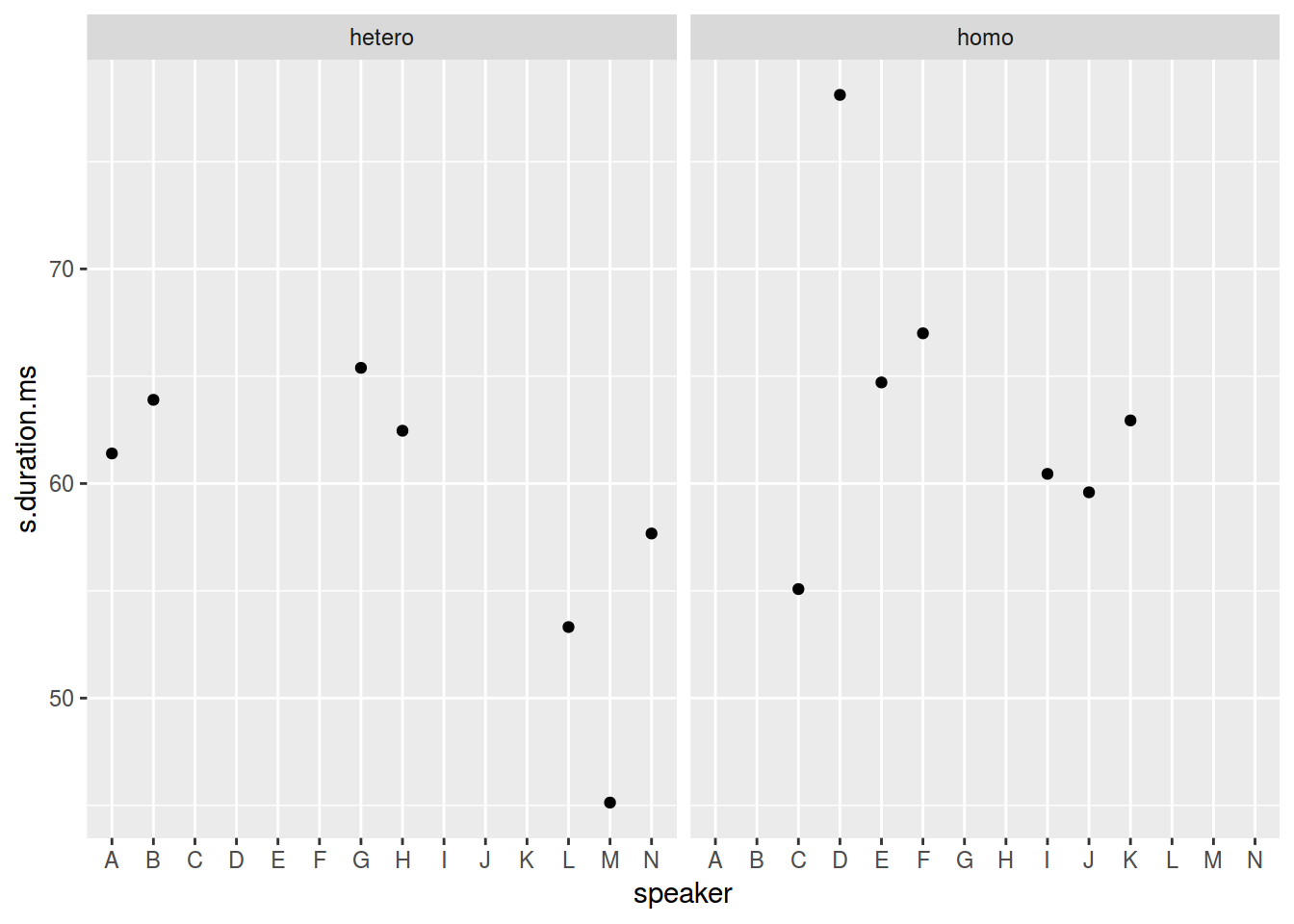
homo %>%
  ggplot(aes(speaker, s.duration.ms))+
  geom_point() +
  facet_wrap(~orientation, scales = "free")
homo %>%
  ggplot(aes(speaker, s.duration.ms))+
  geom_point() +
  facet_wrap(~orientation, scales = "free_x")
6.7.2 ggplot2::facet_grid()
homo %>%
  mutate(older_then_28 = ifelse(age > 28, "older", "younger")) %>%
  ggplot(aes(speaker, s.duration.ms))+
  geom_point() +
  facet_wrap(older_then_28~orientation, scales = "free_x")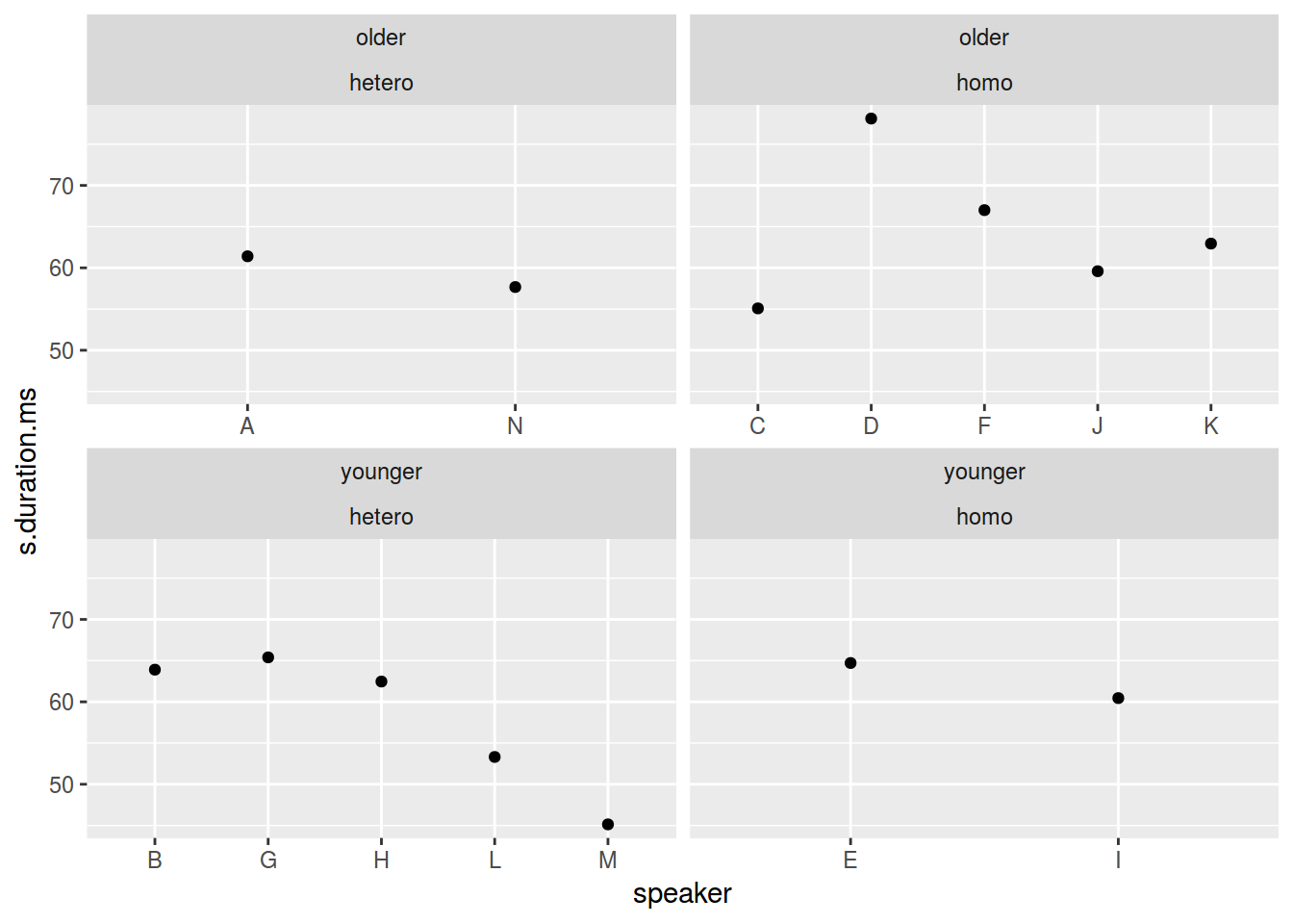
homo %>%
  mutate(older_then_28 = ifelse(age > 28, "older", "younger")) %>%
  ggplot(aes(speaker, s.duration.ms))+
  geom_point() +
  facet_grid(older_then_28~orientation, scales = "free_x")
There is also nice argument margins:
homo %>%
  mutate(older_then_28 = ifelse(age > 28, "older", "younger")) %>%
  ggplot(aes(speaker, s.duration.ms))+
  geom_point() +
  facet_grid(older_then_28~orientation, scales = "free_x", margins = TRUE)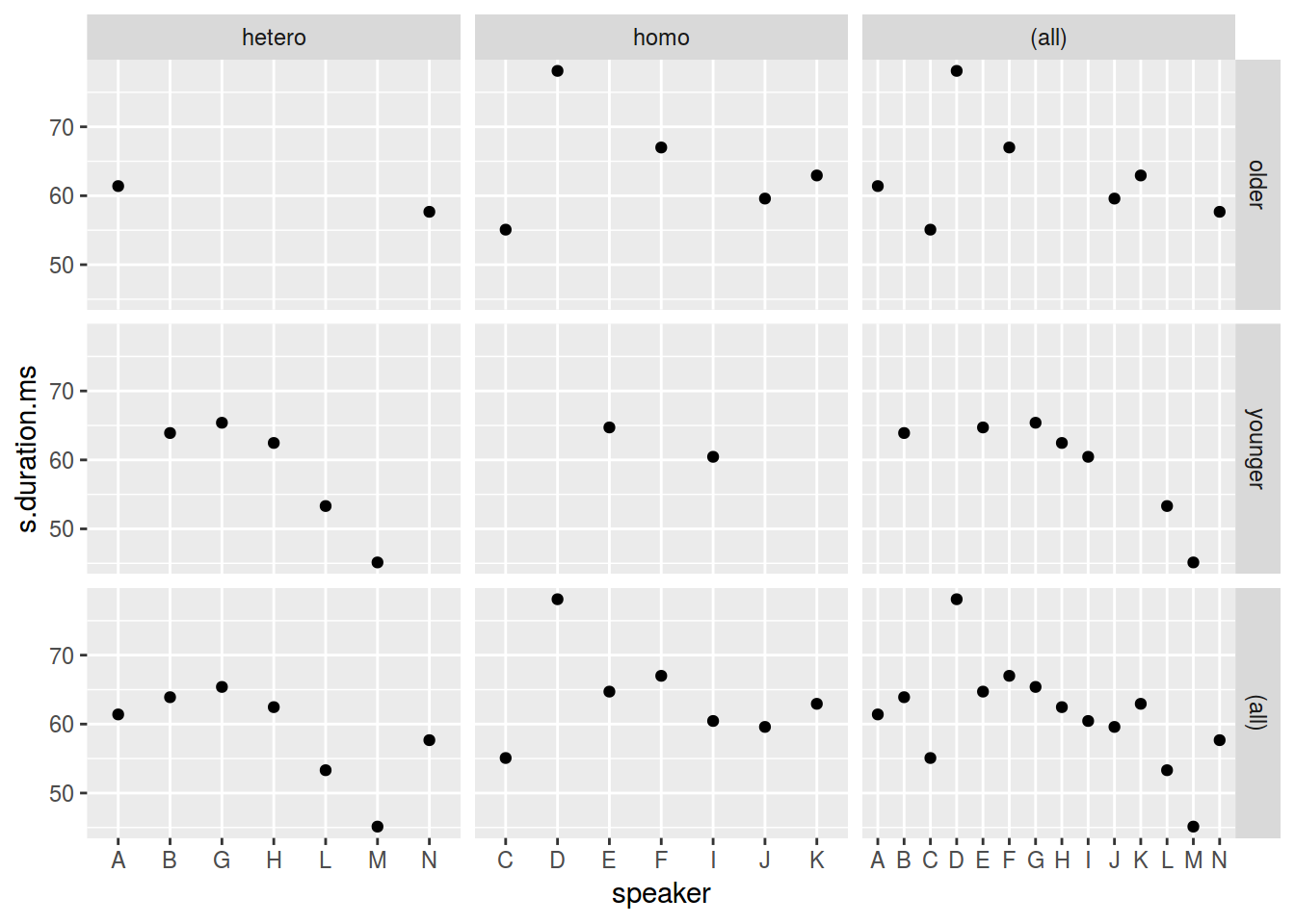
Sometimes it is nice to show all data on each facet:
homo %>%
  ggplot(aes(speaker, s.duration.ms))+
  # Add an additional geom without facetization variable!
  geom_point(data = homo[,-9], aes(speaker, s.duration.ms), color = "grey") +
  geom_point() +
  facet_wrap(~orientation)+
  theme_bw()