4 Data visualisation: ggplot2
4.1 Why visualising data?
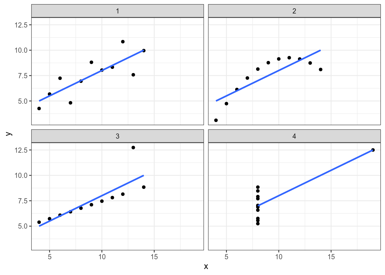
4.1.1 The Anscombe’s Quartet
In Anscombe, F. J. (1973). “Graphs in Statistical Analysis” there was the following dataset:
quartet <- read_csv("https://raw.githubusercontent.com/agricolamz/2020.02_Naumburg_R/master/data/anscombe.csv")
quartet
quartet %>%
group_by(dataset) %>%
summarise(mean_X = mean(x),
mean_Y = mean(y),
sd_X = sd(x),
sd_Y = sd(y),
cor = cor(x, y),
n_obs = n()) %>%
select(-dataset) %>%
round(2)Let’s visualise those datasets:
4.1.2 The DataSaurus
In Matejka and Fitzmaurice (2017) “Same Stats, Different Graphs” there are the following datasets:
datasaurus <- read_csv("https://raw.githubusercontent.com/agricolamz/2020.02_Naumburg_R/master/data/datasaurus.csv")
datasaurus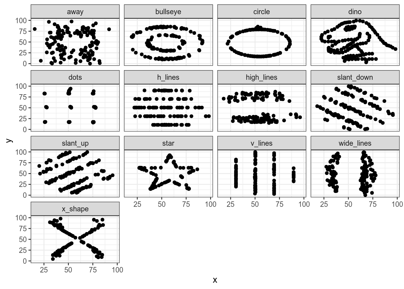
And… all discriptive statistics are the same!
datasaurus %>%
  group_by(dataset) %>%
  summarise(mean_X = mean(x),
            mean_Y = mean(y),
            sd_X = sd(x),
            sd_Y = sd(y),
            cor = cor(x, y),
            n_obs = n()) %>%
  select(-dataset) %>%
  round(1)
4.2 Basic ggplot2
ggplot2 is a modern tool for data visualisation. There are a lot of extentions for ggplot2. There is also a cheatsheet on ggplot2. There is also a whole book about ggplot2 (Wickham 2016).
Every ggplot2 plot has three key components:
- data,
- A set of aesthetic mappings between variables in the data and visual properties, and
- At least one layer which describes how to render each observation. Layers
are usually created with a
geom_...()function.
4.2.1 Scatterplot
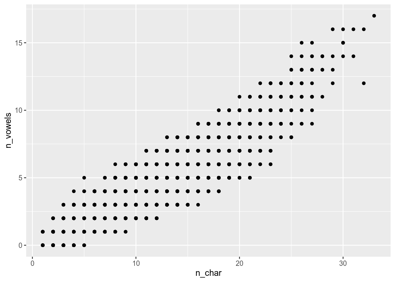
I downloaded a Polish dictionary from here. I removed all abbreviations and proper names and took only one form from the paradigm. After all this I calculated the number of syllables (simply by counting vowels, combinations of i and other vowels I counted as one), number of symbols in each word and extracted the first letter. Here is the result dataset.
Download this dataset to the variable polish_dictionary. How many words are there?
So this data could be visualised using the following code:
ggplot2
dplyrandggplot2
4.2.1.1 Layers
All commands in ggplot2 are separated by + sign (author of the package, Hadley Wickham, deeply regrets that it is not %>%), but their order matters:

4.2.1.2 aes()
Since every ggplot2 plot has data as a key component there is a function aes() that maps variables from dataframe into visual properties of the graph. There is a simple rule:
If values are from dataframe put them into aes(), otherwise — don’t.

There are some other possibilities to mark categories:
- with
shapeargument
polish_dictionary %>%
  filter(first_letter == "a" |
           first_letter == "i" |
           first_letter == "u") %>%
  ggplot(aes(n_char, n_vowels, shape = first_letter))+
  geom_point()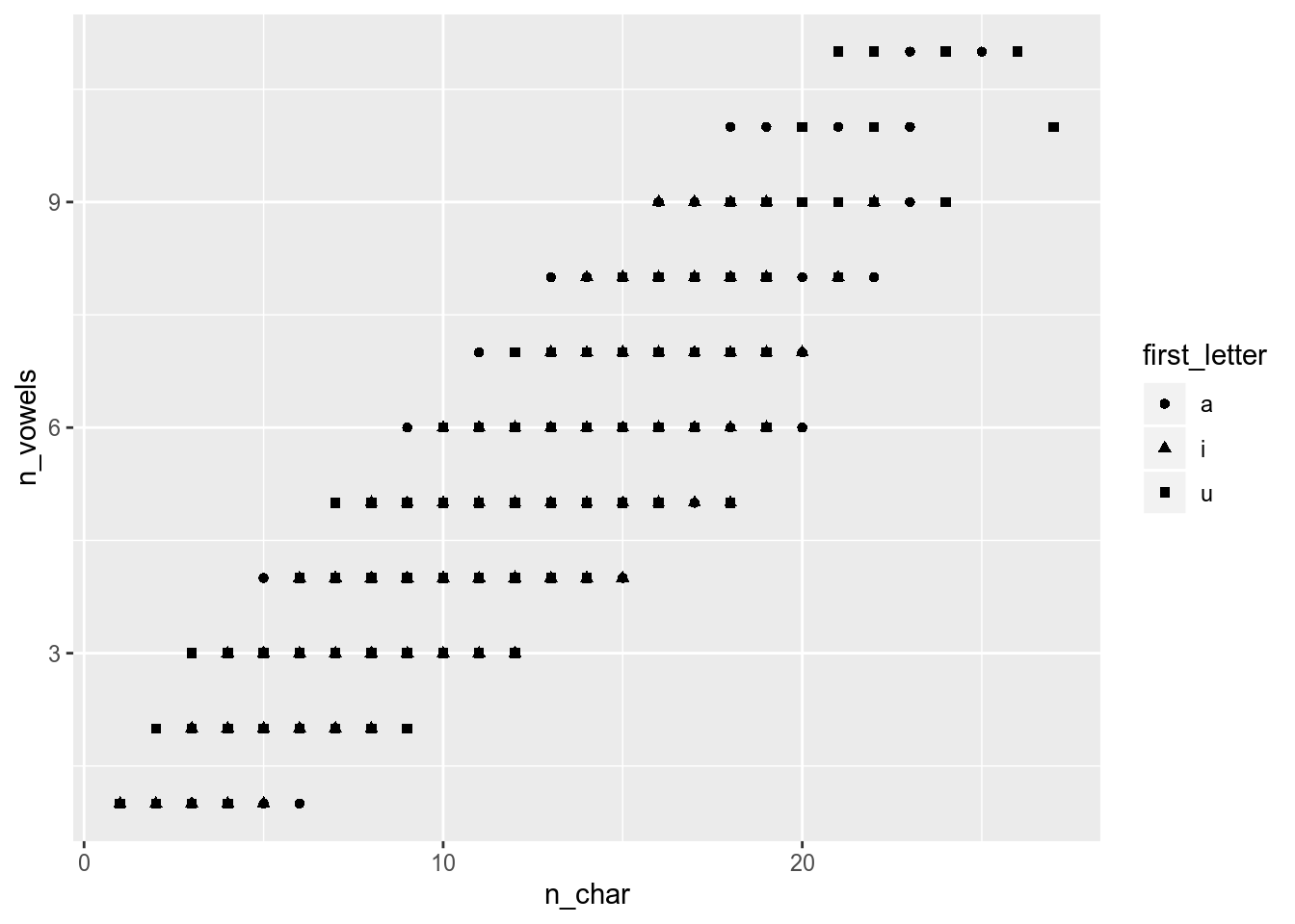
- with
labelargument andgeom_text()
polish_dictionary %>%
  filter(first_letter == "a" |
           first_letter == "i" |
           first_letter == "u") %>%
  ggplot(aes(n_char, n_vowels, label = first_letter))+
  geom_text()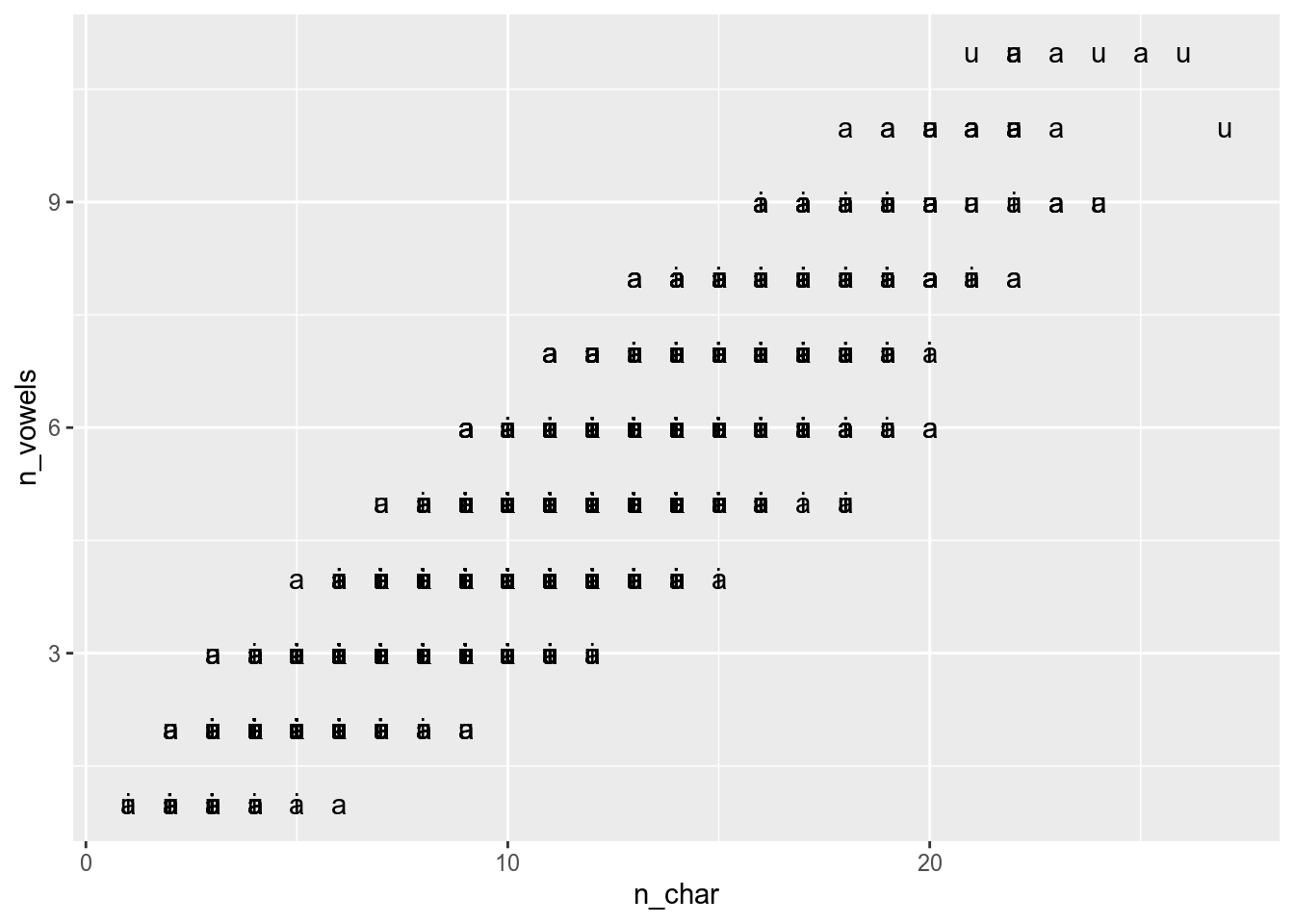
- with
opacityargument
polish_dictionary %>%
  filter(first_letter == "a" |
           first_letter == "i" |
           first_letter == "u") %>%
  ggplot(aes(n_char, n_vowels))+
  geom_point(alpha = 0.1)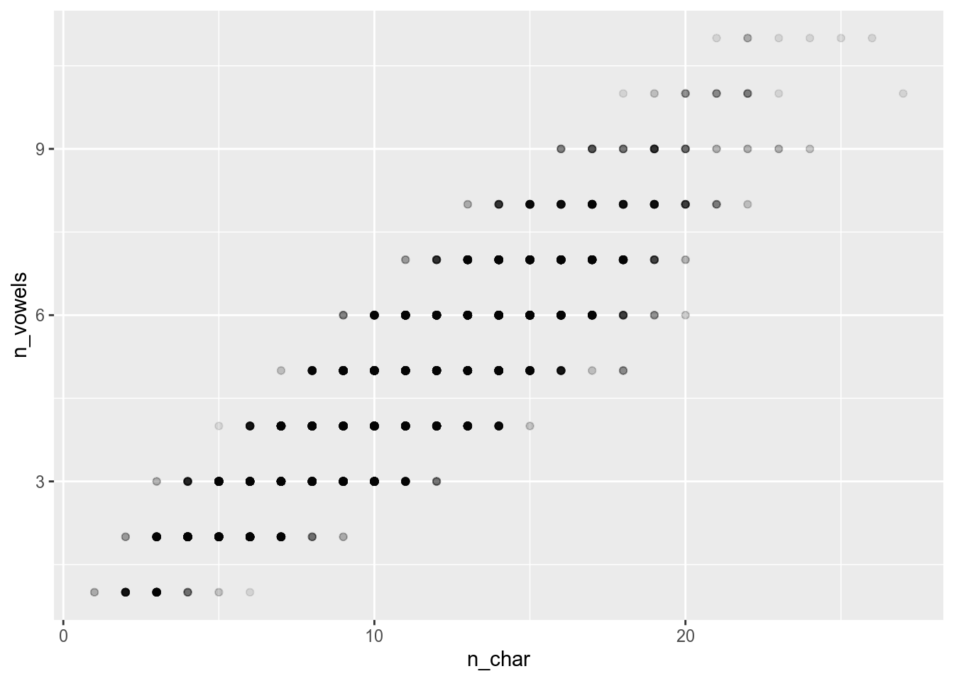
Sometimes annotations overlap:
polish_dictionary %>%
  slice(8400:8450) %>%  # lets pick 50 words from our dictionary
  ggplot(aes(n_char, n_vowels, label = word))+
  geom_text()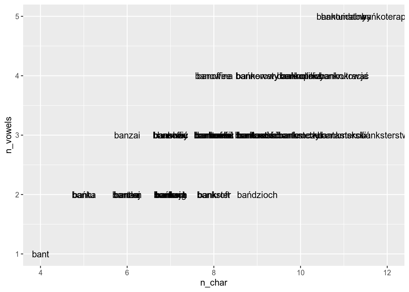
Then it is better to use geom_text_repel() from the ggrepel library (do not forget to download it using install.packages("ggrepel")):
library("ggrepel")
polish_dictionary %>%
  slice(8400:8450) %>%
  ggplot(aes(n_char, n_vowels, label = word))+
  geom_text_repel()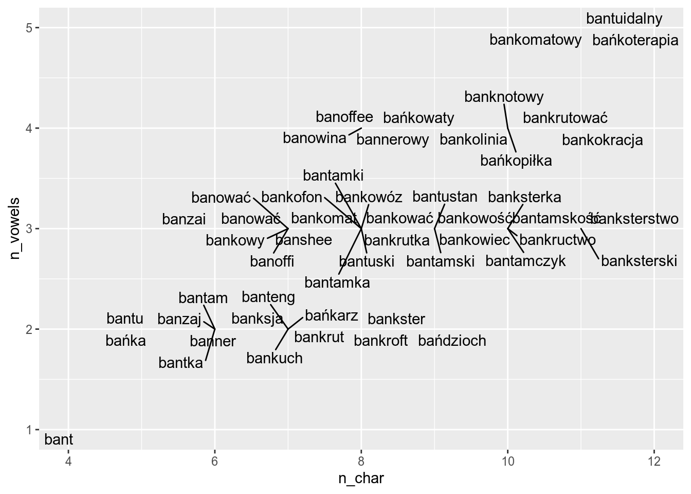
It looks better, when you add some points:
polish_dictionary %>%
  slice(8400:8450) %>%
  ggplot(aes(n_char, n_vowels, label = word))+
  geom_text_repel()+
  geom_point()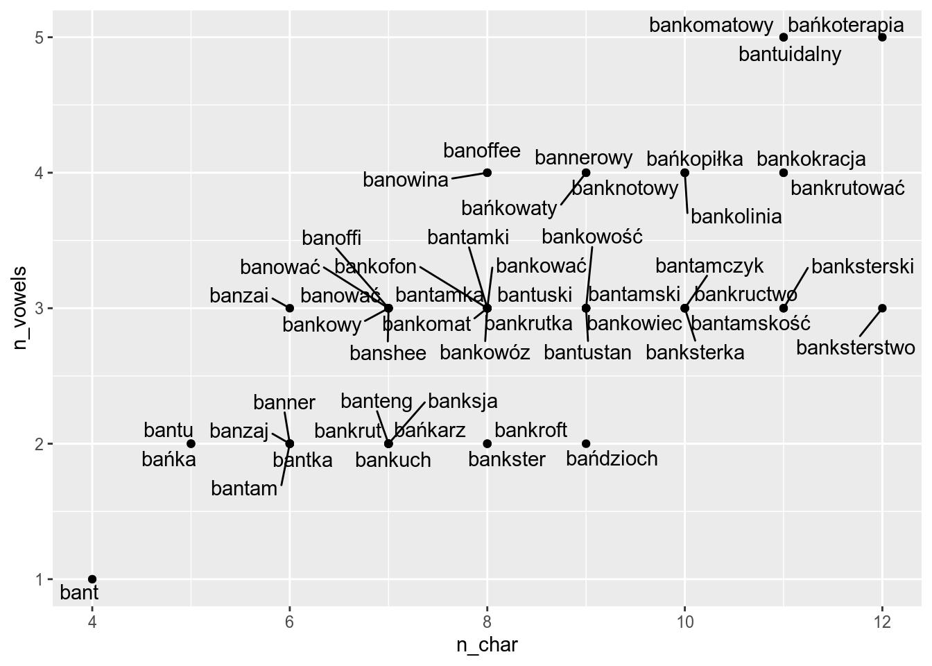
4.2.1.3 Annotate labels, axis, caption etc.
polish_dictionary %>%
  slice(8400:8450) %>%
  ggplot(aes(n_char, n_vowels, label = word))+
  geom_text_repel()+
  geom_point()+
  labs(x = "number of characters",
       y = "number of vowels",
       title = "Correlation of number of characters and vowels",
       subtitle = "data from sjp.pl",
       caption = "this graph is created with ggplot2")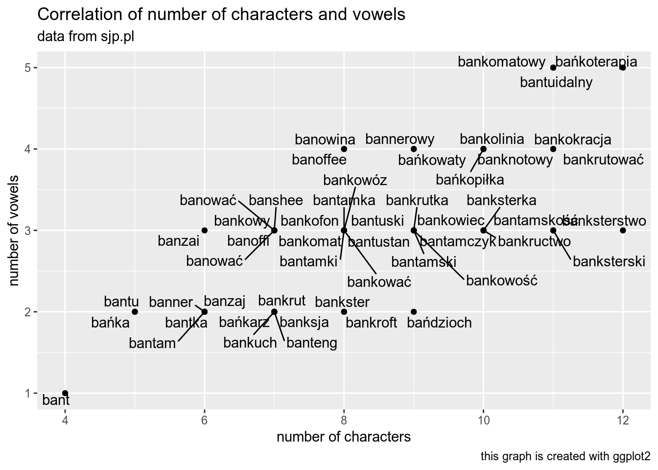
Download this dataset and create a scatterplot. What is there?
4.2.2 Barplots
The same data can be aggregated and non-aggregated:
misspelling <- read_csv("https://raw.githubusercontent.com/agricolamz/DS_for_DH/master/data/misspelling_dataset.csv")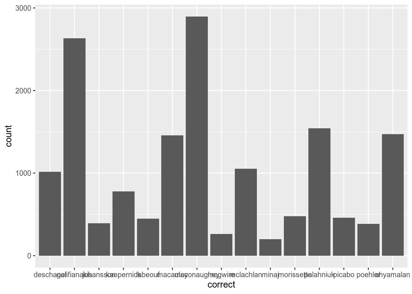
misspelling- variable
spellingis aggregated: for each value ofspeelingvariable there is a corresponding value incountvariable. - variable
correctis non-aggregated: there isn’t any variable associated with counts ofcorrectvariable
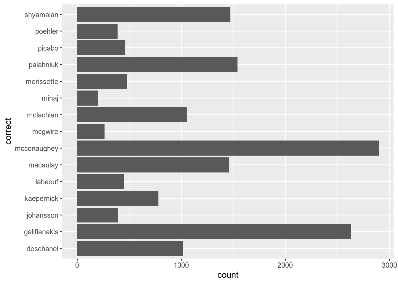
In order to create a bar plot from aggregated data you need to use geom_col():
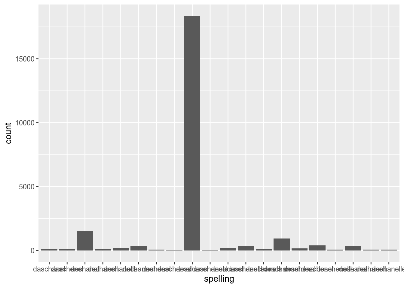
Lets flip axes:
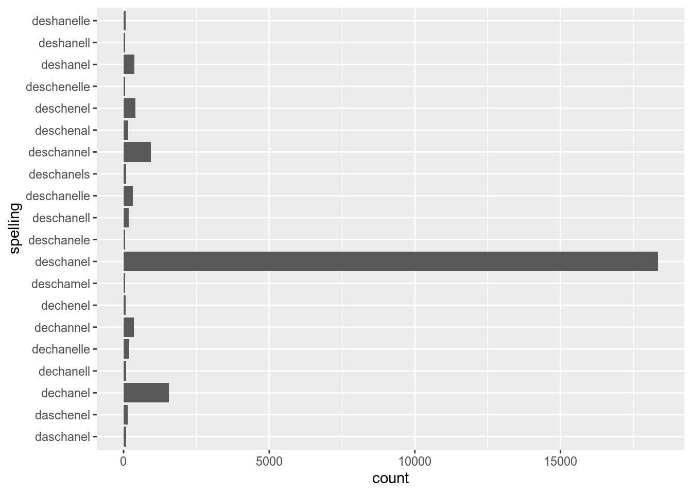
In order to create a bar plot from aggregated data you need to use geom_bar():
Lets flip axes:
Non-aggregated data could be transformed into aggregated
Aggregated data could be transformed into non-aggregated
Coloring bars actually should be done with fill argument. Compare:
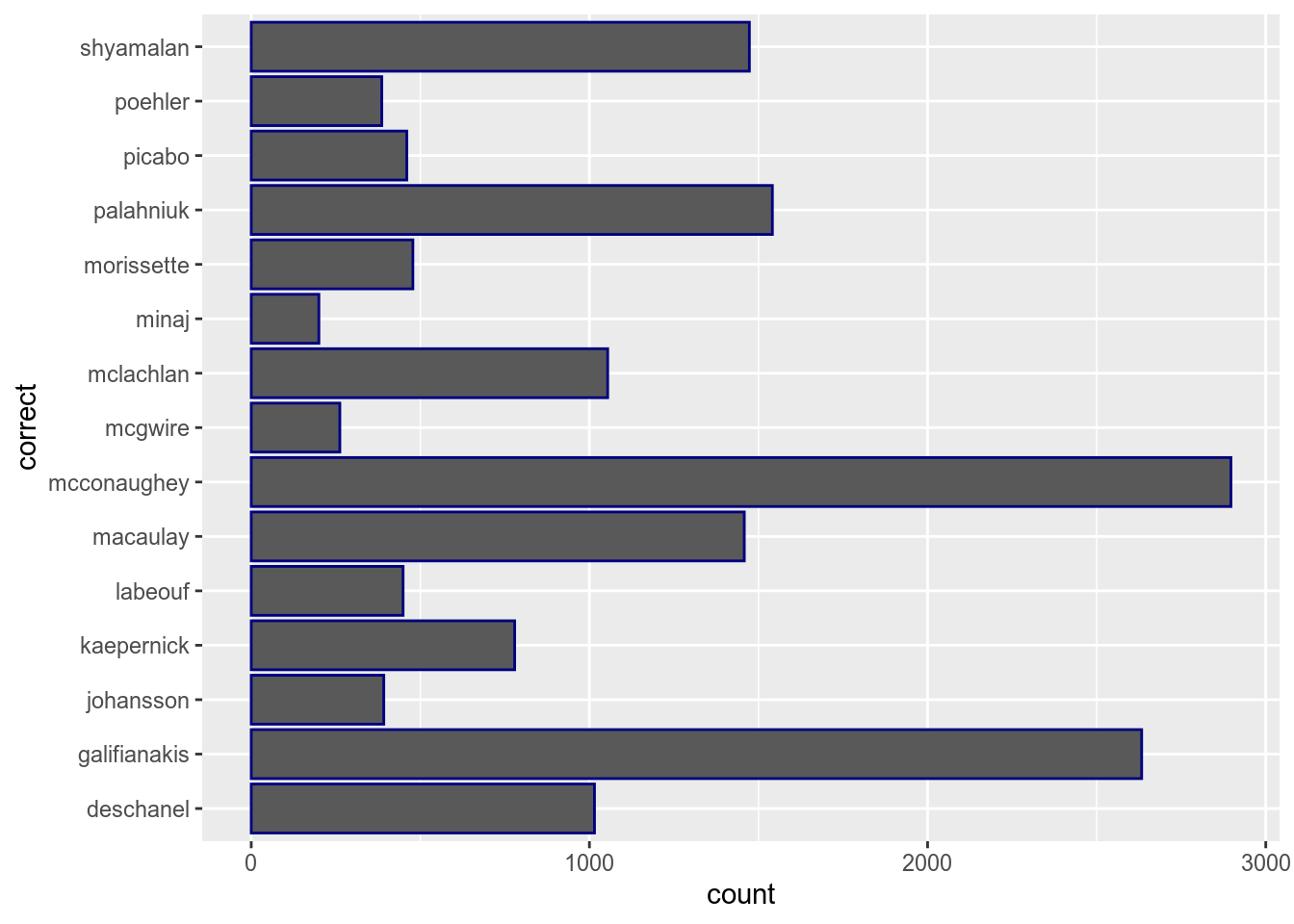
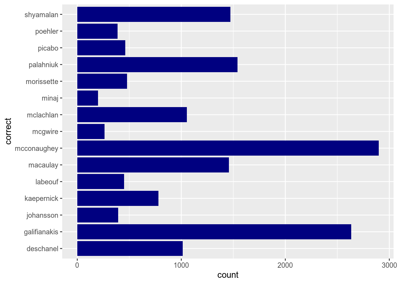
The same argument could be used in the aes() function:
4.2.2.1 Factors
All variables in the previous section are ordered alphabetically. In order to create your own orders we need to look at factors:
## [1] deschanel deschanel deschanel deschanel deschanel deschanel
## 15 Levels: deschanel galifianakis johansson kaepernick labeouf ... shyamalan## [1] "deschanel" "galifianakis" "johansson" "kaepernick" "labeouf"
## [6] "macaulay" "mcconaughey" "mcgwire" "mclachlan" "minaj"
## [11] "morissette" "palahniuk" "picabo" "poehler" "shyamalan"## [1] shyamalan shyamalan shyamalan shyamalan shyamalan shyamalan
## 15 Levels: shyamalan poehler picabo palahniuk morissette minaj ... deschanelmisspelling %>%
mutate(correct = factor(correct, levels = c("deschanel",
"galifianakis",
"johansson",
"kaepernick",
"labeouf",
"macaulay",
"mcgwire",
"mclachlan",
"minaj",
"morissette",
"palahniuk",
"picabo",
"poehler",
"shyamalan",
"mcconaughey"))) %>%
ggplot(aes(correct))+
geom_bar()+
coord_flip()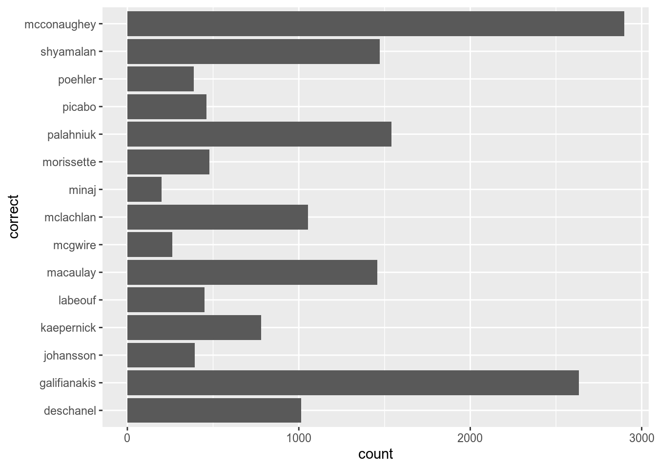
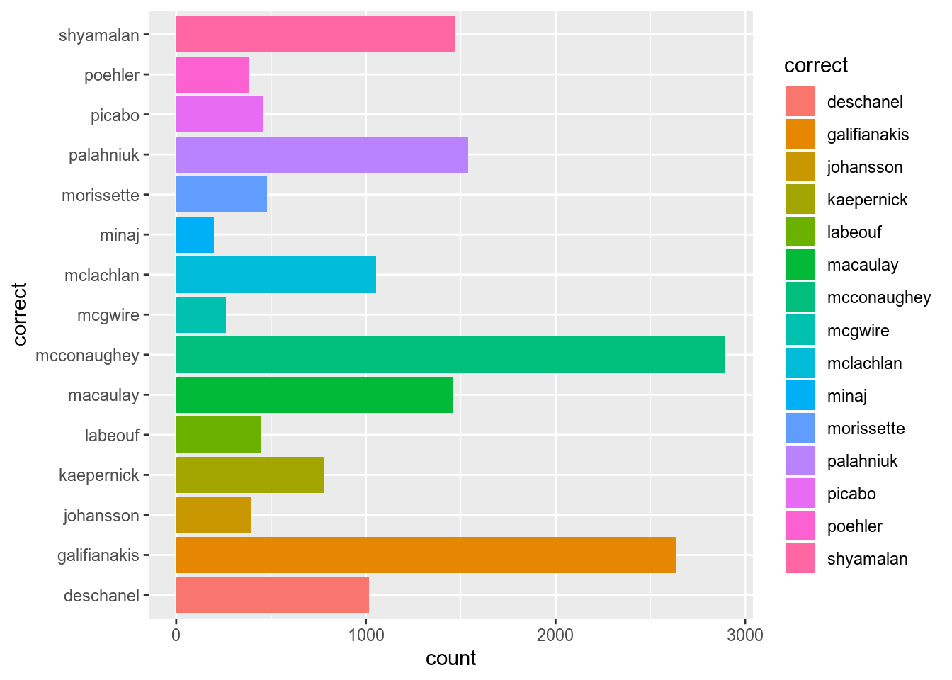
There is a package forcats for factors (it is in tidyverse, here is a cheatsheet). There are a lot of useful functions in forcats, but the one I use the most is the fct_reorder() function:
misspelling %>%
count(correct) %>%
ggplot(aes(fct_reorder(correct, n), n))+
geom_col()+
coord_flip()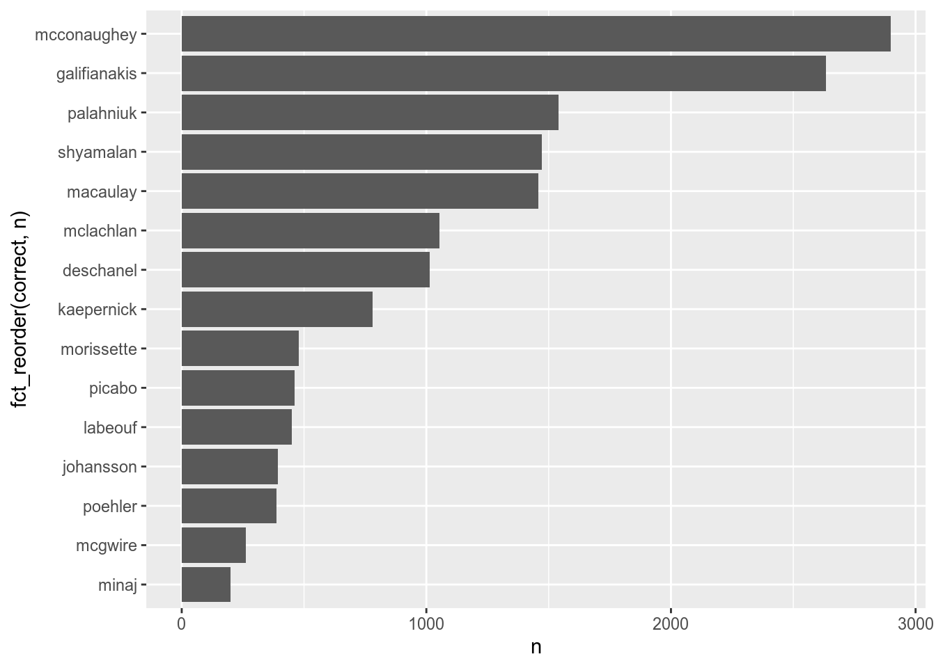
There is an article on Pudding about English pubs. Here is an aggregated dataset, that they used. Visualise the 30 most popular pub’s names in UK.
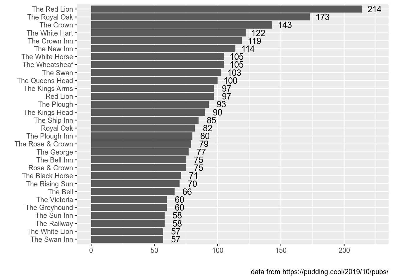
📋 list of hints ➡
👁 How to get this counts? ➡
Use thecount function. 👁 Why there are so many values? ➡
In the task I asked you to take only 30 of them. Maybe you need theslice() function in order to do it. 👁 Why there are pubs with count 1 on my graph?. ➡
By default thecount function does not sort anything, so you get only pubs with frequency 1 from the slice() function. In order to sort your values you need to use the arrange() function or use an additional sort = TRUE argument in the count() function. 👁 It looks like I’ve finished. ➡
Have you removed your x and y axes’ annotation? Have you added the caption?4.3 Faceting
Faceting – is a really powerful tool for data exploration. This function splits visualisations into subplots using some variables.
misspelling %>%
  filter(count > 500) %>%
  ggplot(aes(fct_reorder(spelling, count), count))+
  geom_col()+
  coord_flip()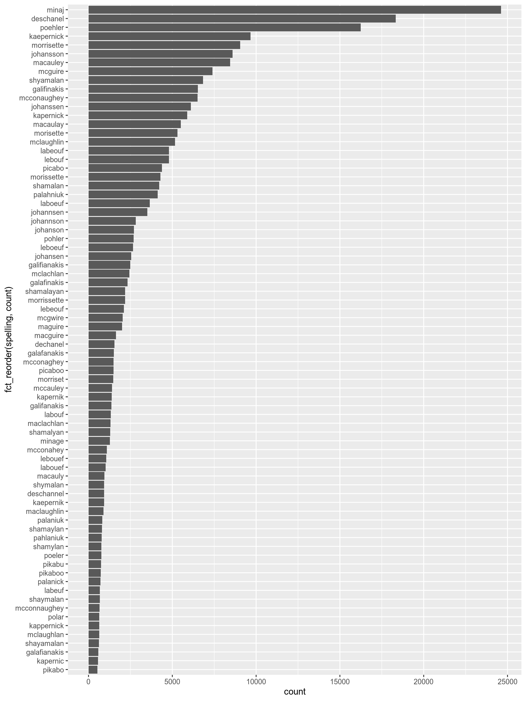
misspelling %>%
  filter(count > 500) %>%
  ggplot(aes(fct_reorder(spelling, count), count))+
  geom_col()+
  coord_flip()+
  facet_wrap(~correct)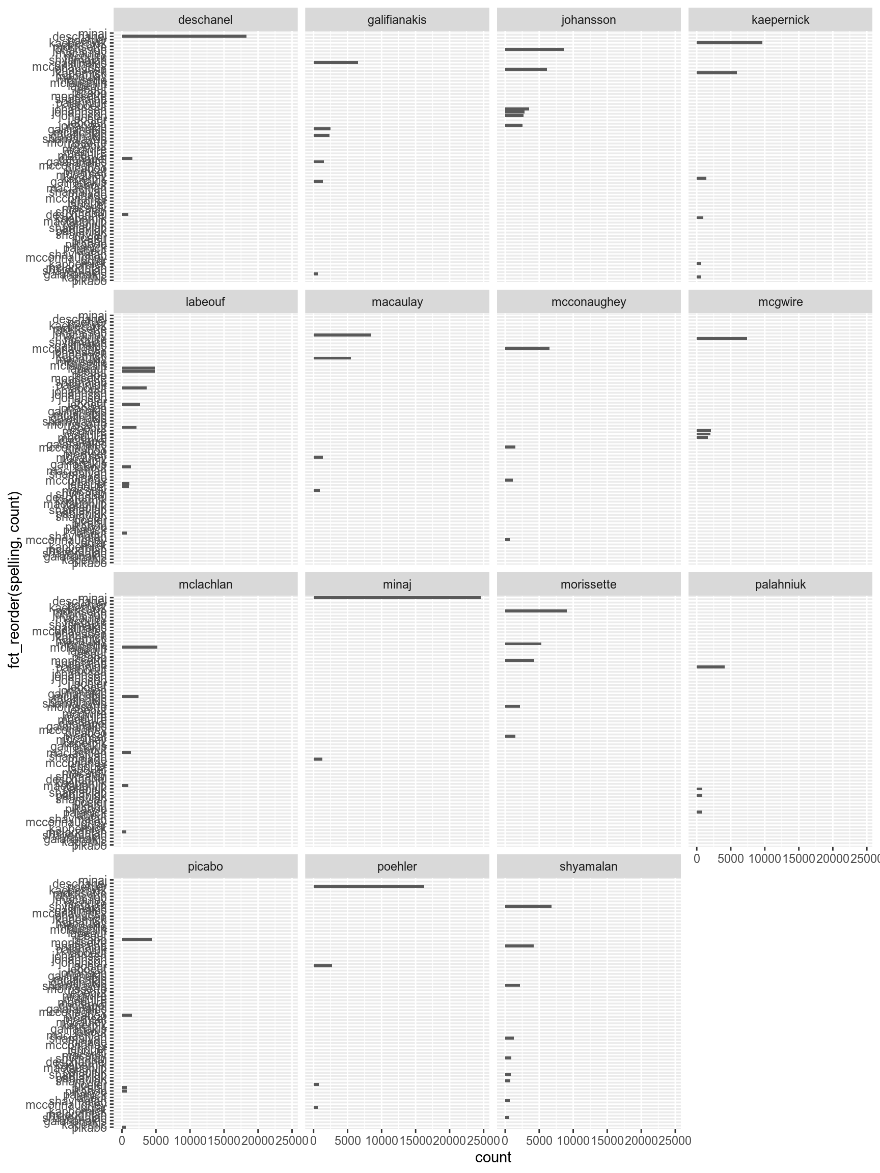
By default facet_wrap() creates the same scale for all facets. This could be changed by argument scales:
misspelling %>%
  filter(count > 500) %>%
  ggplot(aes(fct_reorder(spelling, count), count))+
  geom_col()+
  coord_flip()+
  facet_wrap(~correct, scales = "free")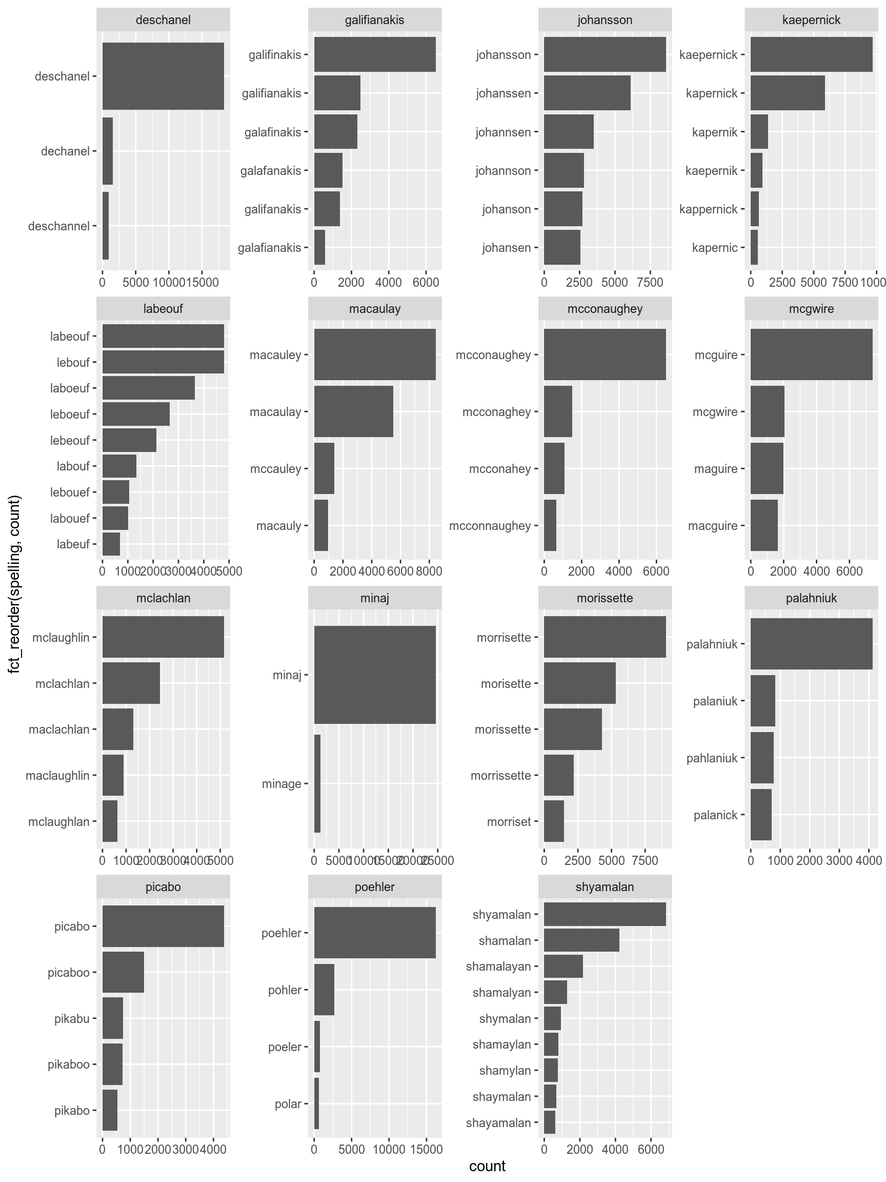
It is also possible to add multiple variables:
diamonds %>%
  ggplot(aes(carat, price))+
  geom_point(size = 0.3)+
  facet_wrap(~color+cut, scales = "free")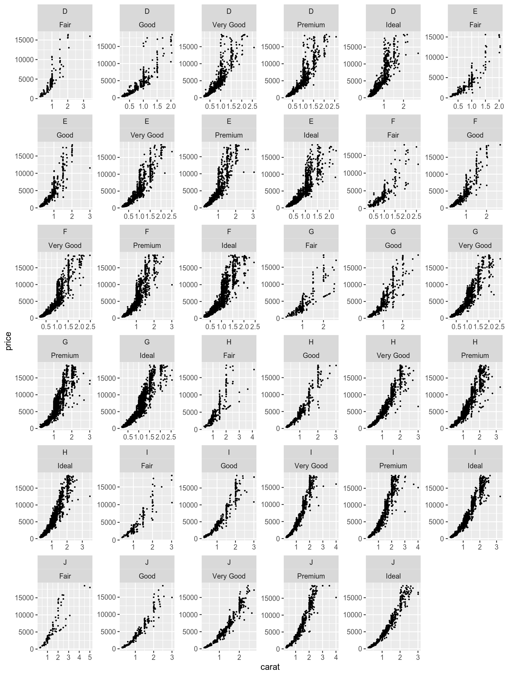
There is a way to make it more compact using the facet_grid() function instead of the facet_wrap() function:
diamonds %>%
  ggplot(aes(carat, price))+
  geom_point(size = 0.3)+
  facet_grid(cut~color, scales = "free")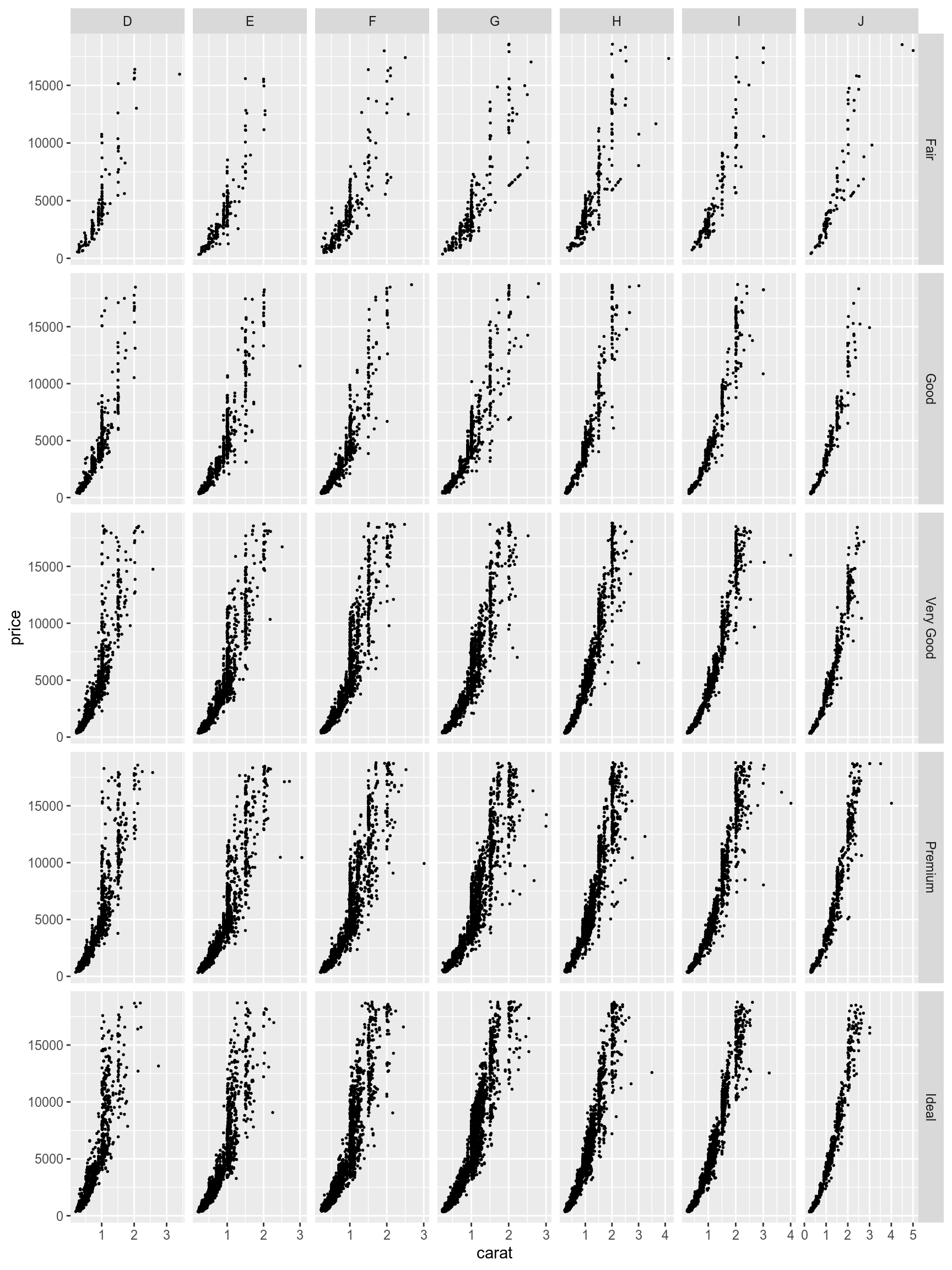
It is also possible to create a marginal summary with the margins argument of the facet_grid() function :
diamonds %>%
  ggplot(aes(carat, price))+
  geom_point(size = 0.3)+
  facet_grid(cut~color, scales = "free", margins = TRUE)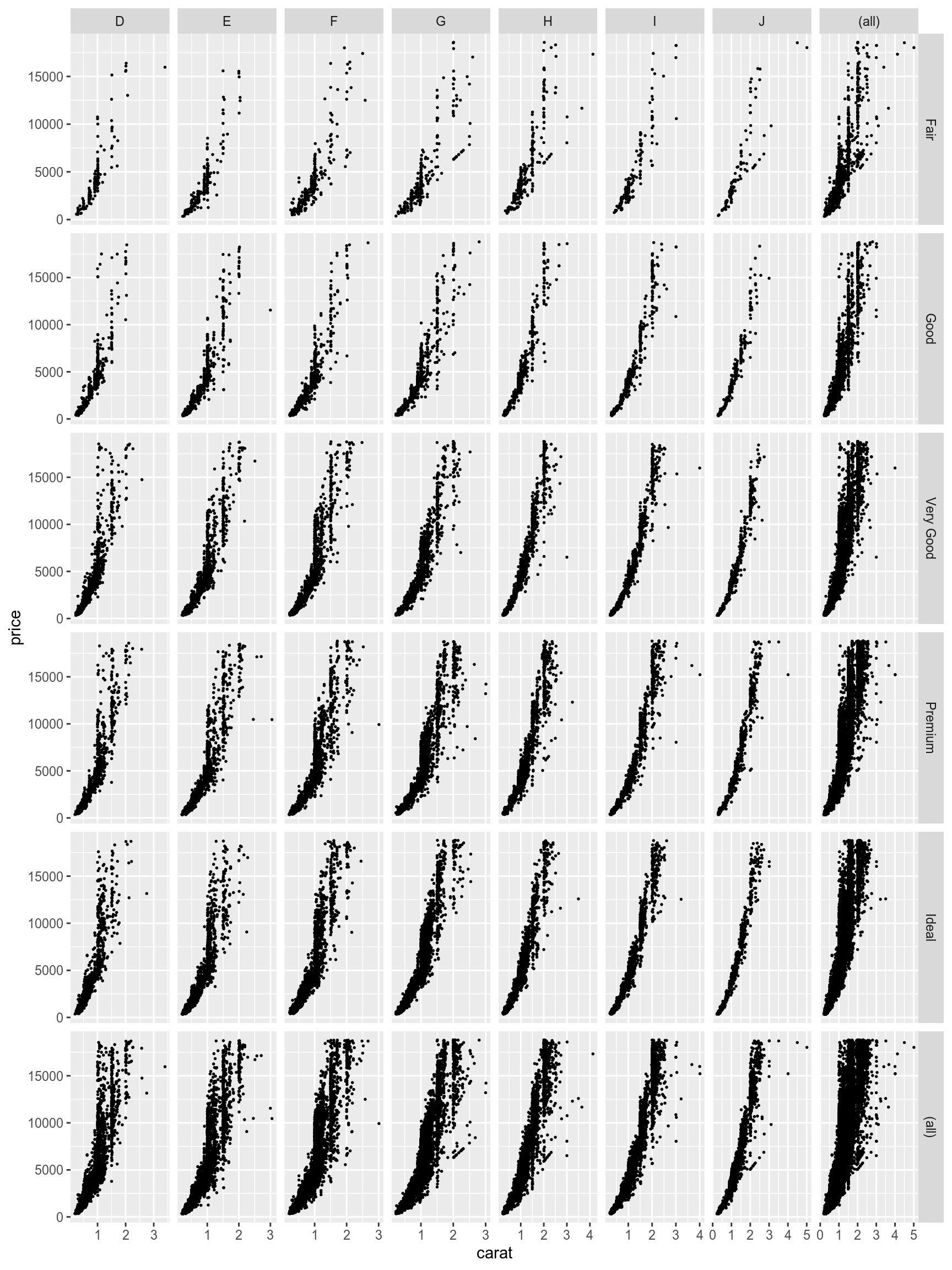
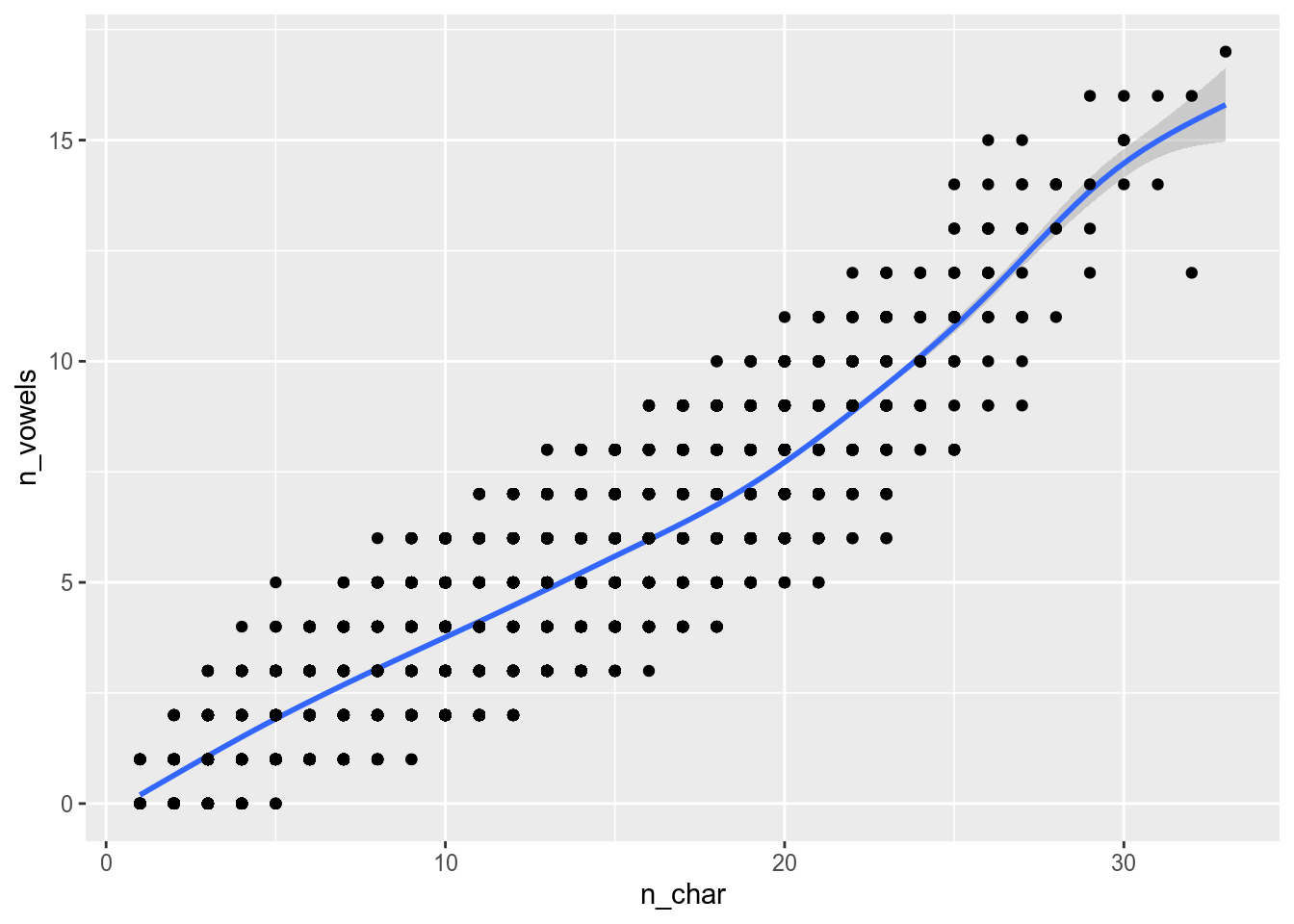
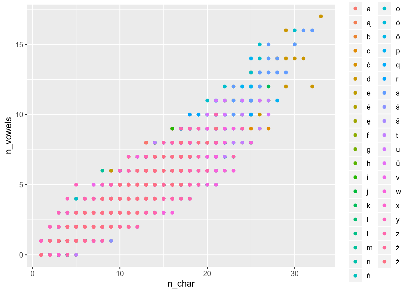
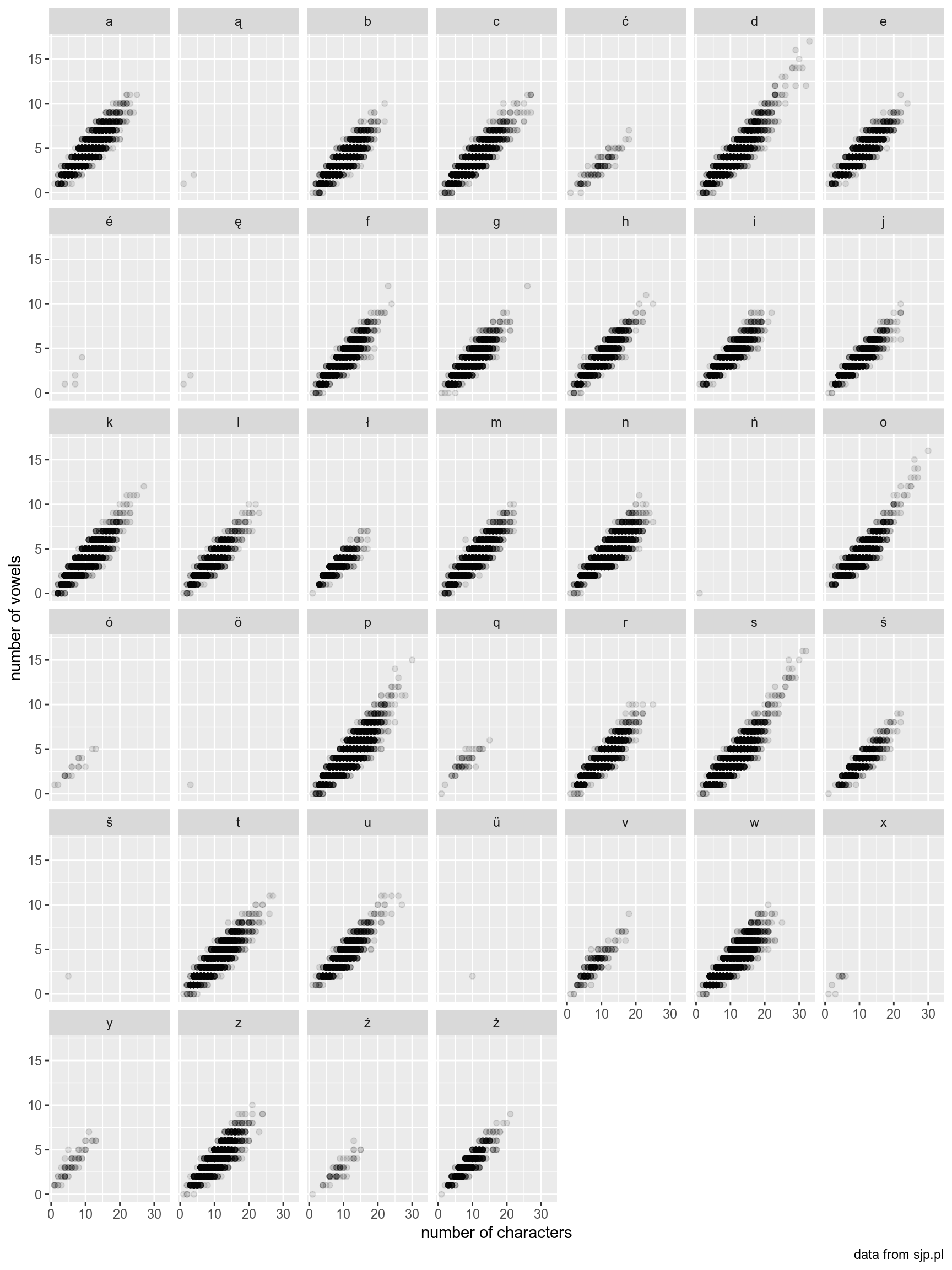
Use the polish_dictionary and reproduce the following graph.
References
Wickham, Hadley. 2016. Ggplot2: Elegant Graphics for Data Analysis. Springer-Verlag New York. https://ggplot2.tidyverse.org.